Building an Illustration System (Not Just Individual Pieces)
This illustrated collection isn’t tied to one city, one destination, or even one region—and that’s intentional.
The buildings shown here come from different projects, different states, and different contexts. What connects them isn’t geography. It’s a shared illustration system designed to adapt across places without losing cohesion.
This is what illustration looks like when it’s built to scale.
Thinking about illustrating a place? Commission a custom illustration →
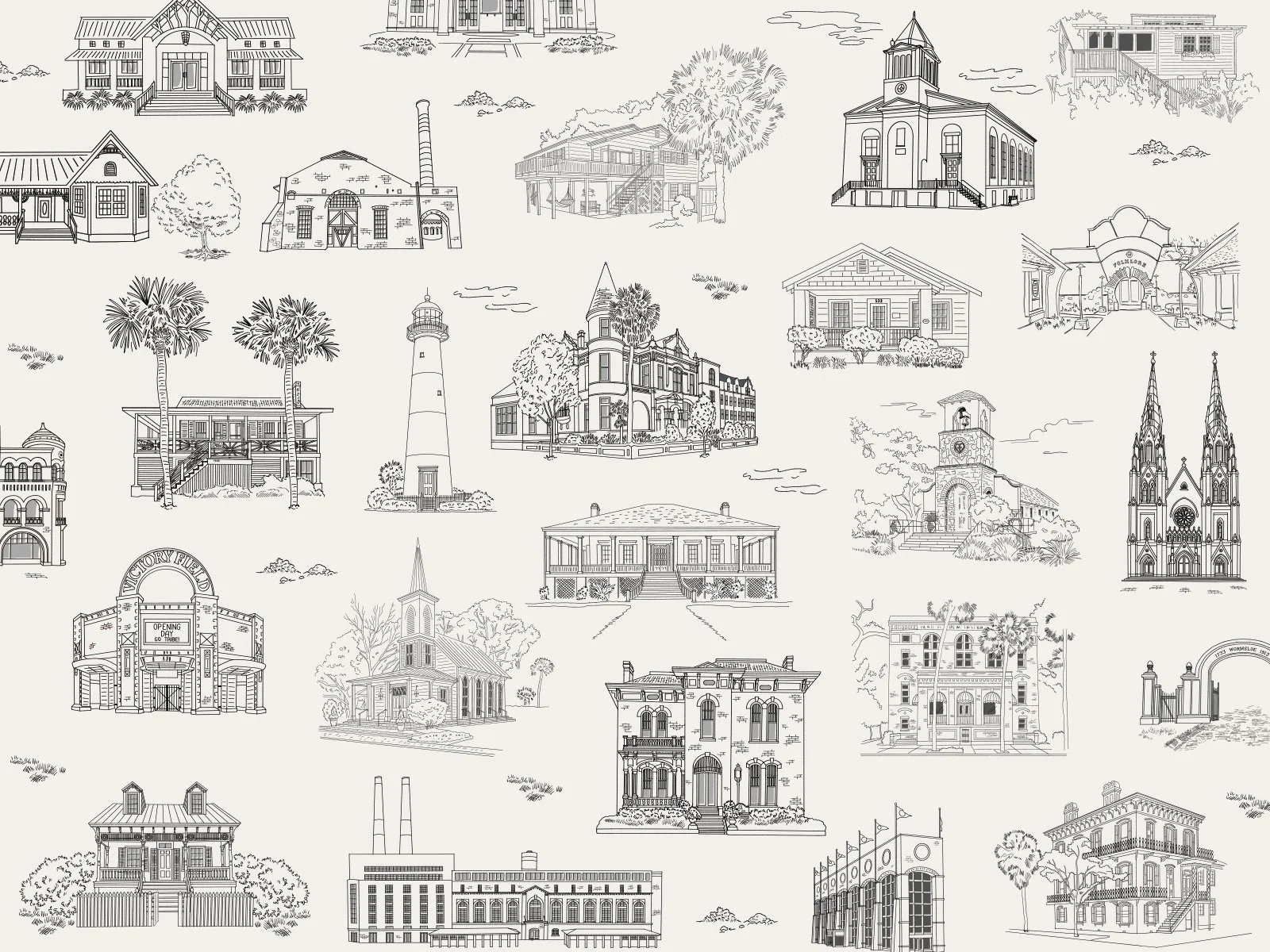
A Collection of Places (That Actually Get Along)
Here’s the thing: not every illustration project starts with a single destination and a tidy story arc.
Sometimes it starts with a question like, “What happens when all these places need to live together?”
The illustrations shown here come from different projects, different regions, and very different types of places. They weren’t drawn to represent one town. They were drawn to prove something else entirely: that place-based illustration works best when it’s treated as a system.
This Isn’t One Place — It’s a Visual Language
Each building in this collection was illustrated to stand on its own and play nicely with others. Same visual rules. Same sense of scale. Same level of detail.
That consistency is intentional. It means these illustrations can be mixed, rearranged, expanded, and reused without everything falling apart visually. A historic inn can sit next to a civic building. A venue illustration can live comfortably beside a storefront or landmark. No visual shouting. No awkward mismatches.
It’s not about geography — it’s about cohesion.
Why This Matters (Especially for Places)
Places rarely need just one illustration.
They need a set. A family. Something that can grow over time without feeling patched together. That’s why this approach works particularly well for towns, destinations, hospitality groups, and venue collections — anywhere a single image won’t cut it.
Illustration, when done this way, becomes infrastructure. It supports maps, guides, signage, patterns, print, digital experiences — all without reinventing the wheel every time someone adds a new building to the mix.
Not Architectural. Not Precious. Very On Purpose.
These aren’t technical drawings, and they’re not meant to be.
The goal isn’t perfect accuracy — it’s recognition. Enough detail to feel specific. Enough restraint to stay flexible. Everything is simplified, stylized, and slightly interpretive so it can adapt across formats without breaking.
In other words: designed to be used, not just admired.
Systems Thinking, but Make It Illustration
This is where my UX brain sneaks in.
Whether I’m working on interfaces, brand systems, or illustration, I’m always thinking about what happens next. How does this scale? How does it stay consistent? How does it grow without starting over?
This collection reflects that mindset. Each piece is part of something larger — even when the “larger” hasn’t been defined yet.
If You’re Seeing Your Own Place in This…
Good. That’s the idea.
This isn’t one town. It’s not one project. It’s a framework — built to adapt, expand, and take on the personality of wherever it lands.
Not tied to one town. Very ready for yours.