Dark Horse — Brand Identity & Illustration
Branding · Illustration · Pattern Design
The Concept
Some brands are built around a product. Others are built around a feeling. Dark Horse was always the second kind — a riding club identity rooted in camaraderie, freedom, and the particular romance of horses and open land. The tagline wrote itself: We Ride Together. Wild and Free. Four words that said everything about who this brand was for and what it stood for.
The Challenge: Vintage Without the Clutter
The creative direction for Dark Horse was a deliberate departure. Where other brand explorations in this series leaned into dense illustration and decorative excess, Dark Horse demanded restraint. The challenge was to create a vintage aesthetic using minimal line artwork — clean, confident marks that could live on a saddle pad, a jacket back, a trophy, or a signpost without losing their integrity. Nothing extraneous. Every line earning its place.
The result sits somewhere between a classic American ranch brand and a prep school crest — structured enough to feel established, loose enough to feel alive.
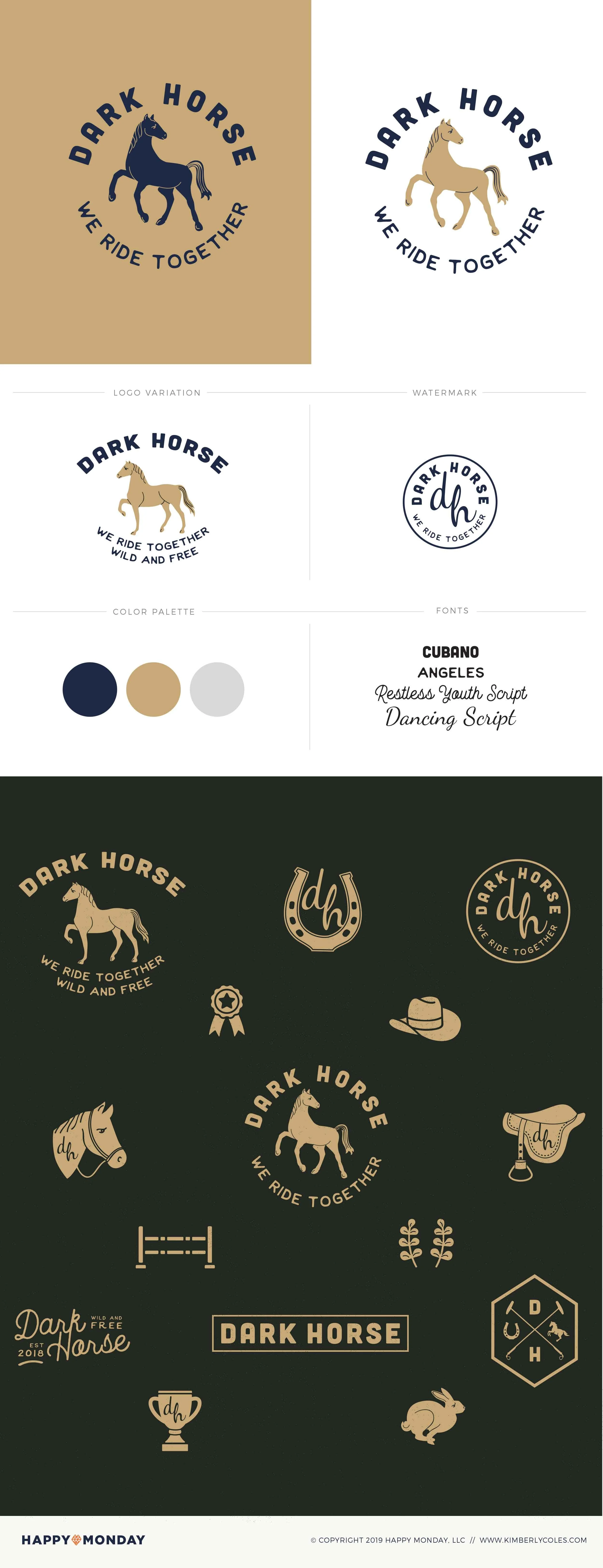
Navy, Gold, and the Weight of Tradition
The palette is three colors and needs no apology for it: deep navy, warm antique gold, and a soft neutral grey. It's the color story of ribbons and trophies, of worn leather and good wool, of institutions that have been around long enough to stop trying to impress anyone. Together they give the brand a quiet authority — the visual equivalent of someone who doesn't need to raise their voice.
The typography follows the same logic. Cubano and Angeles handle the heavy lifting — bold, rounded, slightly compressed — while Restless Youth Script and Dancing Script bring warmth and humanity. The mix of rigid and loose mirrors the brand itself: disciplined structure with a free spirit underneath.
A System That Gallops
The brand board tells the full story of the system's range. The primary logomark — a horse encircled by the wordmark — anchors everything. A logo variation, watermark, and monogram stamp give the mark flexibility across applications. The graphic element suite extends it further: a horseshoe, a cowboy hat, a saddle with the dh monogram, a horse portrait badge, fence rails, botanical sprigs, a trophy cup, a ribbon, a running rabbit, and a hexagonal crest. Each element works alone and as part of the larger family.
This is what a brand system is supposed to do — give you enough pieces to build a world, all speaking the same visual language.
Interested in building a brand with this kind of depth?
If you're building something that needs a mythology behind it — not just a logo — this is the kind of work I love most.