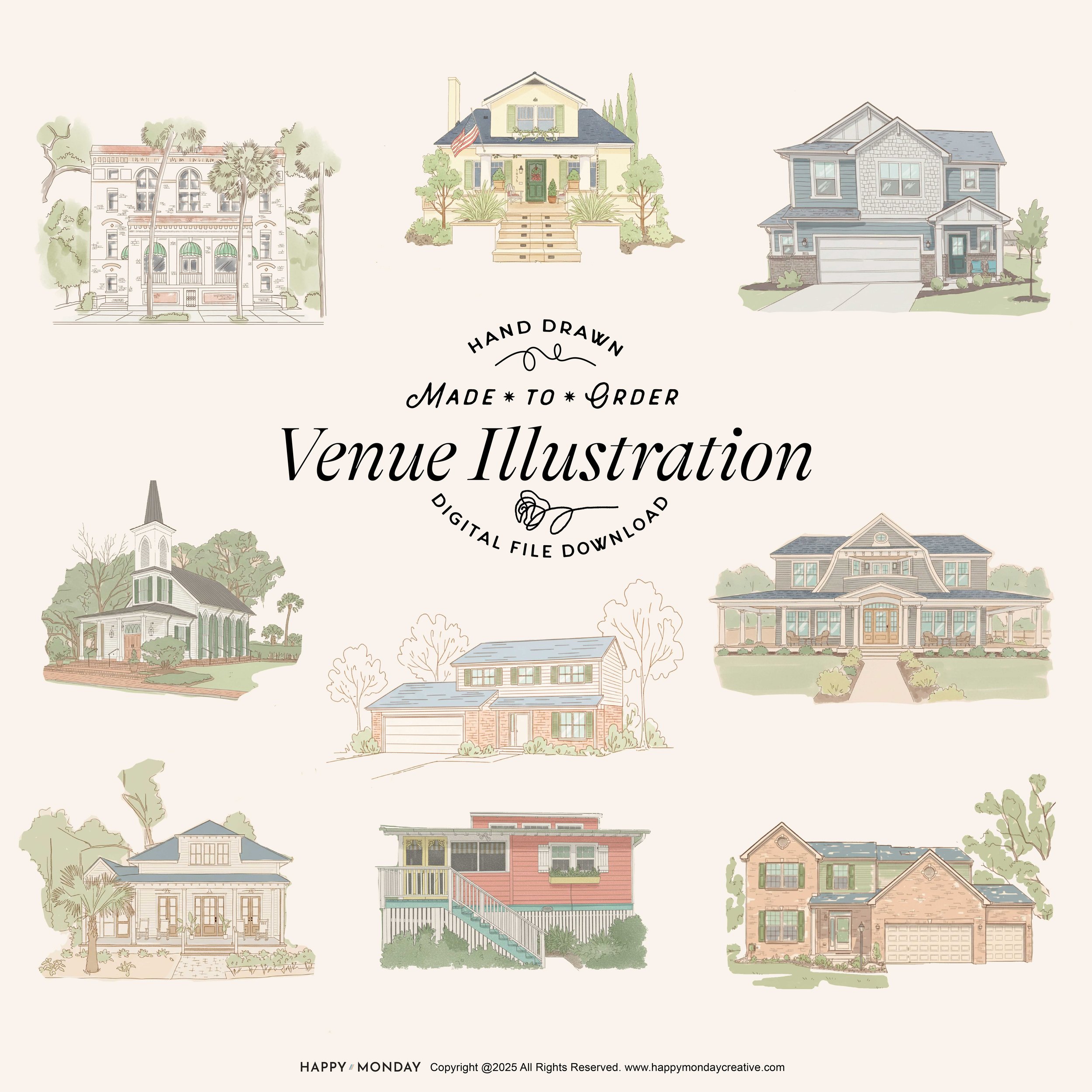
A Retro-Modern Take on Custom Venue Illustrations
I’m introducing a new illustration style now available for custom venue artwork — a Mid-Century Inspired Decorative Line style that’s soft, minimal, and beautifully nostalgic. It’s the kind of aesthetic you might find in a vintage architecture catalog, a retro travel brochure, or a 1950s design sample — clean, airy, and full of character.
This new option builds on the venue illustrations I already create for vacation rentals, boutique properties, and homeowners, but with a distinctly retro twist: ultra-thin linework, muted color washes, and a warm mid-century sensibility that feels both timeless and refreshingly modern.
Perfect for hosts, venues, property managers, or anyone who wants their space captured in a way that feels artful, refined, and uniquely memorable.
What Defines This Style?
This isn’t traditional toile, not classic watercolor, and not editorial line art. It’s a hybrid — a very specific blend of mid-century influence, architectural charm, and decorative minimalism. Here’s what makes it unique:
Ultra-thin, expressive linework – A soft, continuous line defines everything — no bold outlines, no heavy shading. Just delicate, sketchy structure that keeps the illustration breezy and uncluttered.
Muted, sun-washed color palette – Think vintage print ephemera: dusty blues, faded greens, pale peach brick, washed-out neutrals. Color is used sparingly, almost like a light tint rather than a full fill.
Minimal color washes with intentional gaps – Large sections remain unfilled to let the warm background tone show through. This creates a paper-texture effect without overwhelming the eye.
Light, refined architectural detailing – Shingles, bricks, siding, windows, foliage — everything is hinted at, not over-explained. Texture comes from suggestion, not density.
A decorative, airy composition style – The final illustration feels soft, retro, and polished — perfect for framed pieces, welcome guides, print collateral, or digital keepsakes. It’s detailed enough to honor the venue, but minimal enough to feel timeless.
Why This Style Works for Venues
Properties that rely on character — vacation rentals, wedding venues, boutique homes — benefit from artwork that feels personal and beautiful.
This style adds:
warmth without fussiness
elegance without stiffness
nostalgia without feeling themed
decorative value without losing architectural clarity
It’s a great fit for:
Airbnb & VRBO listings
Wedding venue keepsakes
Boutique hotel welcome packets
Real estate client gifts
Homeowners wanting something frame-worthy
How These Illustrations Are Created
Everything starts in Adobe Fresco, sketched by hand using custom brushes tuned for ultra-thin, retro-style linework.
From there, I build the illustration with:
controlled color placement
subtle textural cues
evenly weighted line density
a soft, minimal layout
Ready to Order Your Venue Illustration?
These Mid-Century Inspired Venue Illustrations will be available soon as a made-to-order digital file download.