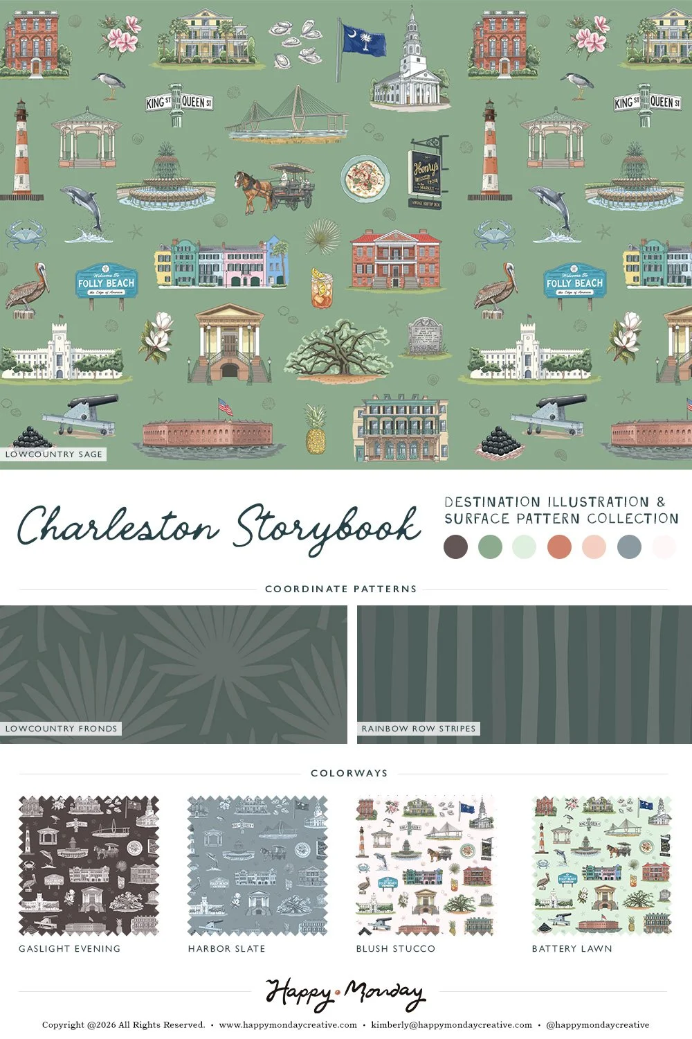
Charleston Surface Pattern: Place-Based Illustration for Licensing
I'm building a collection of place-based surface patterns for licensing—destinations rendered as repeating illustration systems that work on wallpaper, textiles, stationery, home goods, and whatever else needs a sense of place without a postcard vibe.
Charleston is one of them.
Why Patterns, Why Places
Surface pattern design needs subject matter. Places have built-in appeal and built-in audiences.
A Charleston pattern isn't just pretty—it's specific. It signals location without needing a landmark doing all the work. Which means it works for hospitality brands, regional retailers, tourism products, or anyone selling something that benefits from a "made here" or "inspired by here" feeling.
It's also endlessly adaptable. Crop it, scale it, recolor it, flip it. The system holds.
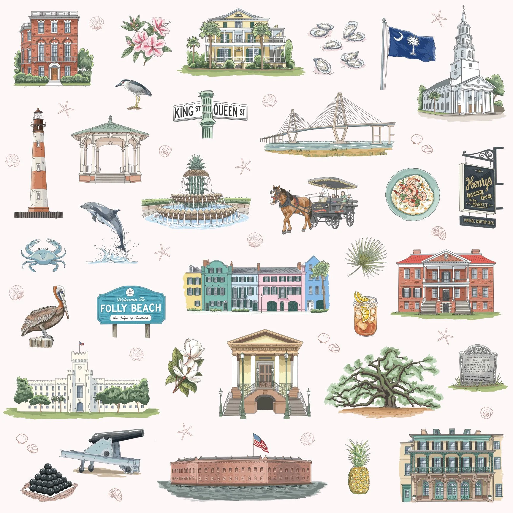
What's in This One
Architectural details from multiple eras. Ironwork. Shutters. Pastel facades. Palmetto trees. Historic signage. Coastal elements.
Nothing fights for dominance. Everything repeats cleanly. The line weight is consistent, the palette is controlled, and the style stays somewhere between illustration and icon—detailed enough to feel authentic, simple enough to scale.
Charleston, but organized.
Where This Kind of Pattern Works
This works across applications:
Destination and tourism branding
Hospitality applications (hotels, inns, vacation rentals)
Packaging and product design
Editorial illustration and city guides
Custom merchandise and souvenirs
Wallpaper, textiles, and large-scale print
Licensing collections built around place and identity
The Bigger Picture
Charleston is part of a growing series. I'm working through coastal and regional destinations—Lowcountry towns, Gulf Coast spots, Great Lakes cities, Southern landmarks—building a portfolio of licensing-ready patterns rooted in real places.
Still in production. More coming soon.