Chattanooga, But Make It a Pattern (Eventually)
I didn’t set out to make a Chattanooga pattern. I set out to draw a few things.
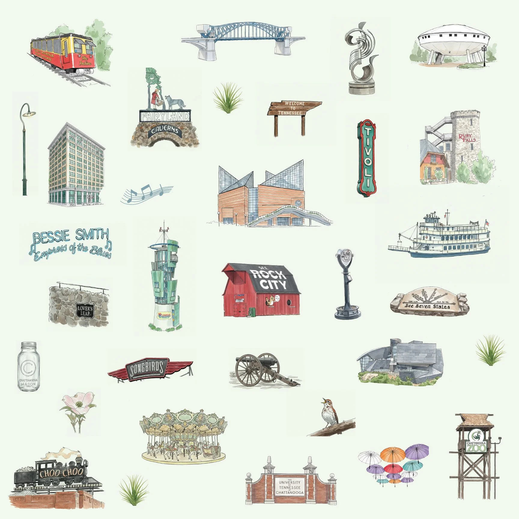
And then suddenly there were bridges. Trains. Riverboats. A carousel. A red barn. And—well—you get the idea.
Bridges, rail lines, river traffic, music history, museums, industry, and landscape all overlap here. What began as a simple destination illustration study quickly became Chattanooga Junction — a place-based illustration system built around movement, structure, and the Tennessee River as a constant throughline.
Why Chattanooga?
Chattanooga is a city of intersections.
River + rail.
Steel + forest.
Industry + art.
History + reinvention.
It’s impossible to reduce it to a single vibe, which makes it exactly the kind of place that benefits from a system-first approach instead of a one-off illustration. I wasn’t interested in creating a postcard version of the city. I wanted something that reflected how Chattanooga moves—how it connects things. So I started drawing anchors.
What’s in the system so far
This collection pulls from a wide mix of landmarks, cultural cues, and everyday details, including:
Bridges, riverfront structures, and lookout points
Rail references and transportation icons
Music history nods (Bessie Smith forever)
Riverboats, terrain elements, and native greenery
Museums, signage-inspired details, and structural forms
Each piece is hand-illustrated with consistent line weight and balance, designed to stand alone or eventually lock together inside a repeat. Right now, they’re playing nicely—but they’re not married yet.
About that pattern…
No seamless repeat yet. No coordinates. No alternate colorways. And that’s intentional.
At this stage, Chattanooga Junction is a modular illustration framework. I’m testing scale relationships, spacing rhythm, and motif hierarchy before forcing it into a tile.
If you’ve ever tried to turn a dense, detail-heavy city into a repeating pattern, you know: rushing this part only guarantees regret later.
The pattern will come. The system comes first.
Color, but not final color
The current palette is a working mix—stone, steel, river blues, softened greens. Think industrial-meets-natural, not “matchy-matchy.”
Once the repeat structure is locked, that’s when colorways, coordinates, and product-driven variations enter the chat.
Where this is headed
Eventually, this collection is designed to support:
Destination retail and museum shops
Hospitality interiors and boutique lodging
Textiles, wallpaper, and home goods
Regional branding and specialty merchandise
Individual motifs will always extract cleanly for spot use—because systems should multitask.
In the meantime…
This is a peek behind the curtain.
Chattanooga Junction is part of an ongoing place-based illustration series exploring how destinations translate into scalable visual systems—not just pretty pictures, but frameworks that can grow.
If you’re into cities with grit, music history, river energy, and just enough chaos to keep things interesting… you’re going to like where this one goes.
Pattern coming soon(ish).

