Resist the Usual: Reimagining the Digital Experience for a Napa Valley Agency
Experience Strategy · Information Architecture · Content Strategy · UX/UI Design · Accessibility · Design Systems
Overview
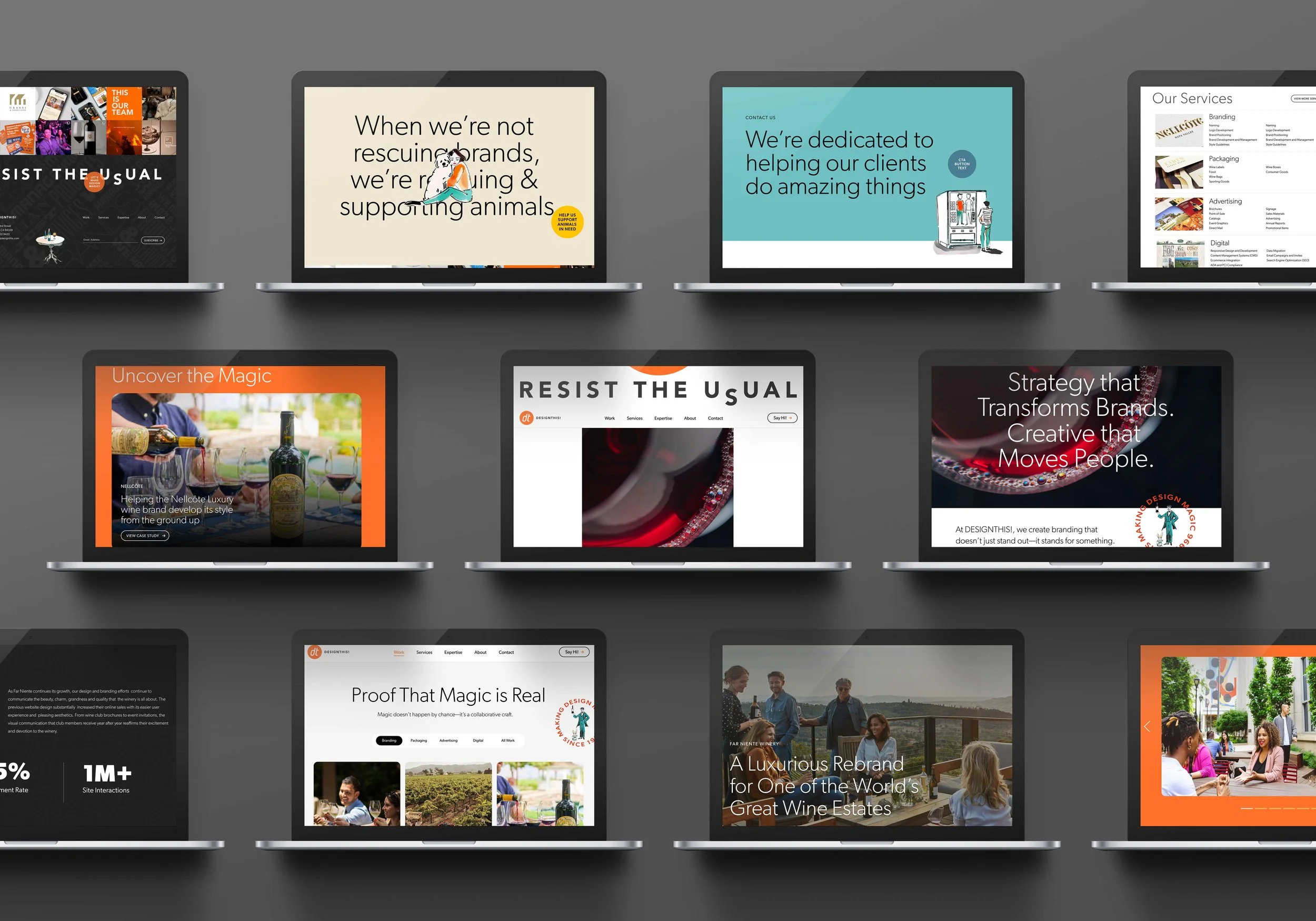
The DESIGNTHIS! website redesign was driven by the agency’s bold ethos—“Resist the Usual”—and the need for a flexible, modular design system that could evolve alongside the brand. The approved pages reflect a confident, high-energy personality, blending bold creativity with strategic clarity.
Brand Direction & Goals
The redesign was guided by DESIGNTHIS!’s established brand positioning—rooted in creativity, legacy, and modern relevance. My role was to translate that vision into a digital experience that:
Showcased the agency’s bold, high-energy personality.
Incorporated storytelling and visual variety while maintaining a cohesive look and feel.
Leveraged a reusable, modular content system for scalability.
Integrated microinteractions and unconventional visual moments to reflect the brand’s ethos of “Resist the Usual.”
Creative Concept & Experience Direction
Before defining layouts and interaction patterns, the work focused on translating DESIGNTHIS!’s “Resist the Usual” philosophy into a digital experience.
The goal wasn’t simply to redesign an agency website — it was to create an experience that expressed confidence, creativity, and momentum while remaining flexible enough to evolve over time.
Concept development focused on:
Translating brand personality into digital behavior and interaction moments
Exploring how motion and pacing could reinforce storytelling
Creating unexpected visual moments without sacrificing usability
Establishing a modular framework that supported experimentation and scalability
Designing an experience that felt expressive, editorial, and distinctly non-templated
This concept-first approach informed the interaction language, content rhythm, motion strategy, and modular system that shaped the final experience.
Experience Strategy, UX/UI & Interaction Design
Homepage:
Sticky navigation with animated tagline reveal for an engaging scroll experience.
Expanding hero visual on scroll to create depth and immersion.
GSAP-powered sticky card stacks to highlight services with motion and clarity.
Statement blocks reinforcing brand personality and values.
Work Listing Page:
Image-forward, editorial-style grid layout for portfolio pieces.
Flexible design accommodating different project depths and formats.
Subtle hover animations for interactivity without distraction.
Work Detail Pages:
Modular, CMS-friendly content blocks for adaptable storytelling.
Core modules include hero + overview, challenge/solution, feature highlights, results, testimonials, and CTAs.
UI Style Guide:
Documented typography scale, color palette, and UI components.
Clear guidelines for microinteractions, hover states, and spacing to ensure long-term consistency.
Interaction & Motion Design
Integrated GSAP ScrollTrigger animations for stacking cards, CTA reveals, and color transitions.
Playful diagonal hover slide on key buttons for subtle “surprise and delight” moments.
Relevance in My Portfolio
This project showcases my expertise in branding-aligned UX/UI design for creative agencies, balancing high-impact visuals with a scalable, modular design system. It’s a prime example of integrating microinteractions and motion design to reinforce brand personality while maintaining accessibility and usability.
How this work applies to your project
If you’re planning a website or digital product redesign, this is the kind of strategic UX/UI thinking I bring to every project. Interested in working together?