Grand Tours, Inc.: Designing a Digital Experience for a Destination & Performance Travel Brand
Brand Strategy & Positioning · Identity Refresh · Experience Strategy · UX Benchmarking Research · Information Architecture · Content Strategy · UX/UI Design · Accessibility · Interaction Design · Design Systems
Overview
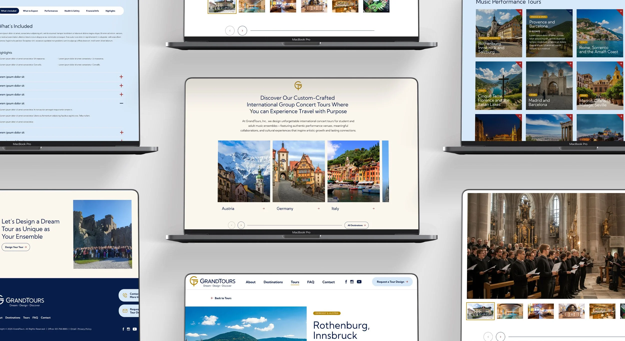
Grand Tours, Inc. creates custom-crafted international concert tours for student and adult music ensembles. Their unique approach blends travel with purpose, fostering meaningful cultural exchange and performance opportunities. I was brought in to help unify their visual identity, refresh their logo, and design a new website experience that captures their sense of family, professionalism, and global reach.
Brand Strategy
The brand strategy phase focused on clarifying Grand Tours’ positioning and personality:
Core Promise – “Travel with Purpose” through authentic performances and cultural connections.
Brand Differentiators – Custom itineraries, meaningful musical collaborations, and a relationship-first approach.
Tone & Voice – Professional yet warm, inspiring trust while evoking a sense of cultural depth and adventure.
Visual Direction – A modern elegance inspired by historical palette references, translated into clean, digital-friendly colors and typography.
This foundation informed all subsequent design decisions, ensuring the site and visual identity consistently reinforce the brand’s mission and values.
Logo Redesign
As part of the rebrand, I created a completely new logomark and selected a new typeface for the wordmark to reflect Grand Tours’ refined, culturally rich positioning. The chosen design draws inspiration from the architectural and decorative motifs found in many of the destinations Grand Tours visits. Its geometric symmetry and clean lines evoke both a sense of tradition and a modern, globally connected outlook.
Website Design Approach
We began by rethinking the homepage as the brand’s cornerstone, introducing a refined color palette, modular content blocks, and a scalable layout system that can carry through to subpages and future growth. The restrained palette conveys authority and tradition, while fresh accents like faded fresco blue and byzantine teal add energy and openness.
The design balances inspiration and usability through:
Clear Hierarchy: Content is broken into digestible, scrollable sections for easy navigation on desktop, tablet, and mobile.
Authentic Photography: Destination and performance images focus on real ensembles, reinforcing credibility and emotional connection.
Inviting CTAs: Strategic placement of “Design Your Tour” guides users through the journey without feeling pushy.
Flexible Modules: Blocks for destinations, tour types, collaborations, testimonials, and stats can be easily re-ordered or expanded in the CMS.
Content Strategy Direction
Since the client was providing their own copy, I focused on creating content-ready modules with clear purposes:
Hero messaging to set the tone and value proposition.
Destination highlights for location-based exploration.
Tour type overviews for audience self-identification.
Collaboration spotlights to reinforce the brand’s differentiators.
Relevance in My Portfolio
This project demonstrates my ability to translate a refined brand into a scalable, user-focused digital experience. It highlights my skills in creating modular design systems for complex, content-heavy sites, balancing elegance with functional UX, and integrating accessible, mobile-first principles. While outcomes are pending launch, the work reflects my expertise in both visual design and strategic site architecture for travel and cultural organizations.