Highland Sanitation: Designing a Task-First Experience for a Community-First Brand
Brand Strategy & Positioning · Experience Strategy · UX Benchmarking Research · Information Architecture · Content Strategy · UX/UI Design · Accessibility · Interaction Design · Design Systems
Overview
Highland Sanitation is a third-generation, family-owned waste management company serving the Twin Cities metro area. The client came to me seeking a website that felt distinct and trustworthy—avoiding a generic “template” look—while still making it fast and easy for customers of all ages to accomplish common tasks like checking schedules, paying bills, and finding services.
Before design began, I worked with the team to refine brand positioning around their differentiators: honesty, integrity, family values, and a service-first mentality over profit-driven competition. I also produced a new sitemap to streamline navigation and surface high-value user tasks.
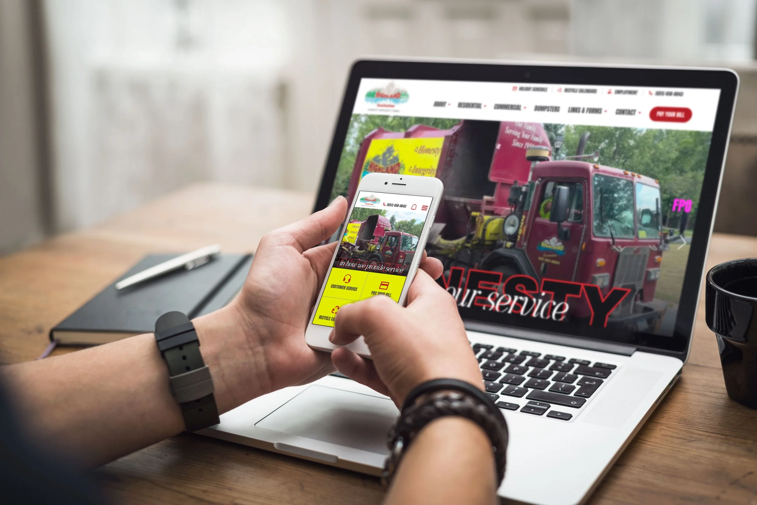
Design Approach
Custom Yet Familiar
Developed a clean, approachable visual system using Highland’s vibrant brand colors in a modern way.
Balanced brand storytelling with utility, ensuring even first-time visitors could complete their goals quickly.
Interactive Seasonal Drawer
Designed a slide-out drawer on the homepage to display holiday schedules and seasonal notices—allowing quick updates without cluttering the page.
Mobile-First Considerations
On the Residential Services listing page, desktop features a balanced three-column card grid, while mobile uses accordions to conserve vertical space and reduce scroll fatigue.
Each service block has consistent visual treatment so no offering appears secondary.
Content Strategy Direction
While the client was responsible for writing their own copy and providing photography, I guided the content framework to ensure clarity and consistency:
Sitemap creation to structure navigation and surface the most-used customer actions first.
Defined content types and reusable blocks (e.g., service teasers, seasonal notices, schedule lookups) so developers could build flexible templates.
Provided character count targets for excerpts and headlines to maintain visual balance.
Recommended creating richer service detail pages, drawing inspiration from best-in-class industry examples.
Directed image needs to ensure each hero section has a clear focal point, with mobile aspect ratios in mind.
Outcome
This project has not yet launched, but the initial design phase established a clear, consistent system of reusable blocks, purposeful navigation, and subtle interactive touches that differentiate Highland’s brand while keeping the experience intuitive. The client is now developing content and photography within this approved design framework before handoff to development.
Relevance in My Portfolio
This project highlights my ability to combine brand positioning with UX/UI design for service-driven businesses. It demonstrates my skill in:
Translating business values into practical, user-friendly design.
Designing mobile-optimized layouts that respect real-world usage contexts.
Incorporating subtle, purposeful interactivity (seasonal drawer) to elevate the experience without sacrificing performance or accessibility.