IIDA Northland — Reimagining the Member Experience Through Editorial-Inspired Design
UX Benchmarking Research, Information Architecture Strategy, Content Strategy, UX/UI Design, Accessibility Compliance, Interaction Design,UI Style Guide Development
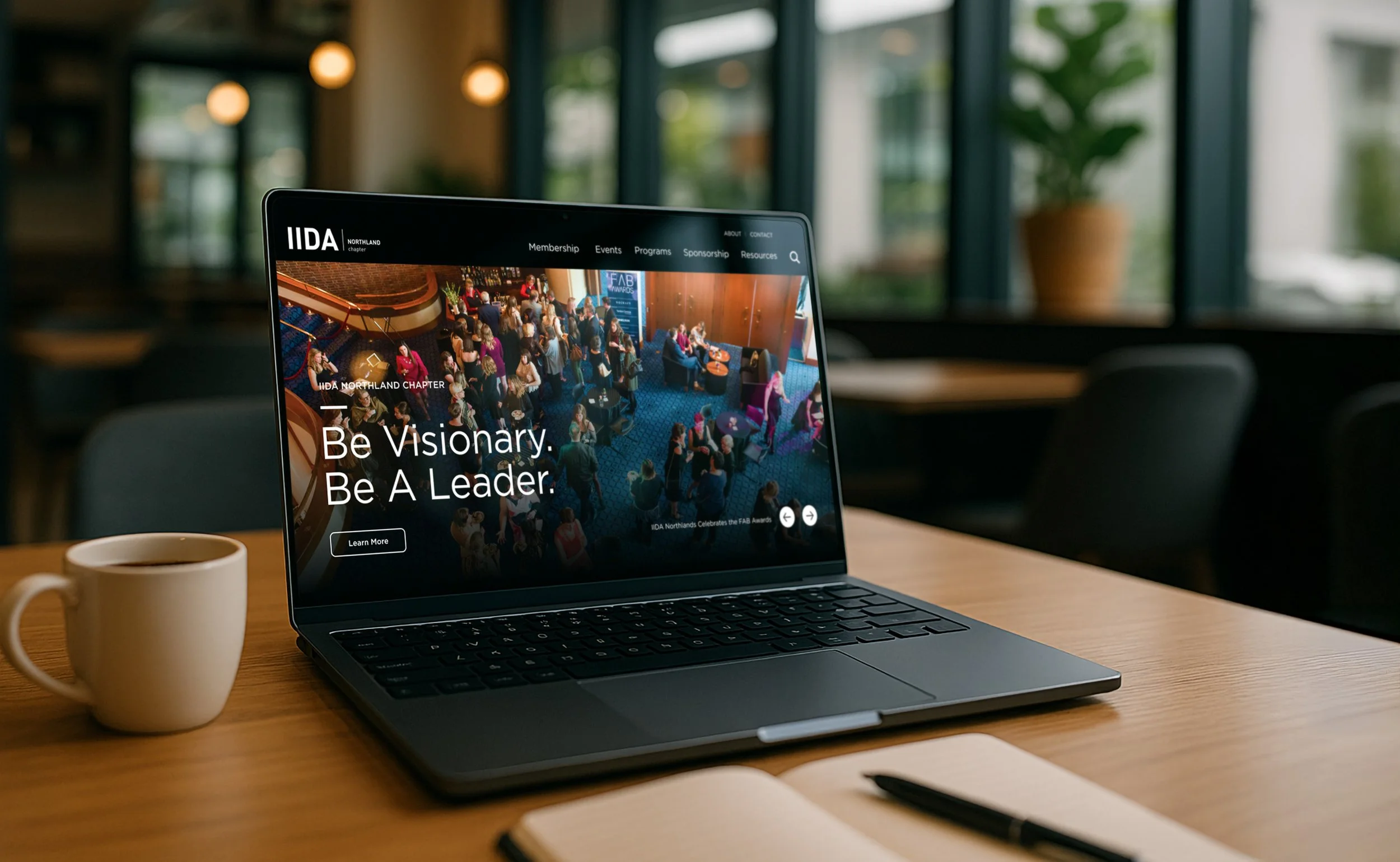
Overview
The International Interior Design Association (IIDA) Northland Chapter needed a refreshed website that better reflected its vibrant, creative community while delivering a modern, accessible, and professional user experience. My role was to create a visually striking, ADA-compliant design system that elevated their brand while making content easier to navigate and engage with.
Challenge
The existing site was functional but lacked a cohesive visual style, clear hierarchy, and ADA-compliant color usage. The client wanted to:
Communicate the chapter’s credibility and creativity
Present information for multiple audience needs: events, membership, news, and community stories
Make navigation more intuitive
Improve mobile usability and accessibility standards
Goals
Establish a modern, bold, and vibrant visual style that supports the brand.
Create clear pathways to high-priority actions: Join, Learn, Engage.
Ensure ADA compliance for all interactive elements and readability.
Improve navigation with a mobile-friendly mega menu.
Build flexible content blocks for reuse across the site.
Process
Brand & Accessibility Audit: Reviewed IIDA’s brand guidelines to identify colors usable for interactive elements while meeting WCAG contrast standards.
Content Strategy Alignment: Mapped site goals to content needs — upcoming events, membership benefits, news, and stories — to inform homepage block selection.
Wireframing & Layout Planning: Structured the site into clear, scrollable sections with intentional whitespace for visual breathing room.
Visual Design & UI Kit: Developed a dark-themed interface with bold accent colors, clean typography, and large imagery to convey professionalism and creativity.
Navigation Optimization: Designed a mega menu with three-column structure, thumbnails, and descriptive text for clarity.
Responsive & Interactive Planning: Defined hover states, on-scroll microanimations, and mobile navigation patterns to enhance engagement.
Key Design Features
Color Scheme: Predominantly black and white with bold pops of brand colors in backgrounds and small elements.
Typography: Clean, readable fonts with strong hierarchy for scannability.
Imagery: Large, high-quality images showcasing events, members, and chapter impact.
Structure: Logical flow guiding users from awareness to action (Events → Stories → Membership).
Whitespace: Generous, editorial-style spacing for a clean, uncluttered look that enhances readability and gives content room to breathe.
Accessibility: All interactive elements meet WCAG color contrast standards.
Outcome
The redesigned site provides a bold yet approachable user experience, balancing IIDA’s creative brand personality with professional credibility. The generous, editorial-style spacing paired with high-impact visuals creates a polished, publication-like feel, elevating the perception of the organization. The flexible block system ensures content can be easily repurposed across pages, while ADA-compliant color usage enhances accessibility for all users.
The result is a modern, engaging, and user-friendly platform that positions IIDA Northland as the go-to resource for interior design professionals in the region.
Relevance in My Portfolio
This project demonstrates my ability to merge brand-driven creativity with strategic, user-focused design. The IIDA Northland redesign highlights:
Editorial-quality visual design with generous whitespace, strong hierarchy, and high-impact imagery.
Accessibility expertise, adapting brand colors to meet ADA standards while preserving vibrancy.
Flexible, reusable content systems that support evolving site needs without additional development overhead.
Multi-audience design thinking, balancing the needs of members, prospective members, sponsors, and the public.
This case study is a strong example of my end-to-end UX/UI process — from brand analysis and accessibility audits to layout planning, interactive design, and responsive execution.