Indianapolis Icons
Travel Illustration & Destination Pattern System. A place-based illustration system built from the landmarks, architecture, and everyday culture of Indianapolis.
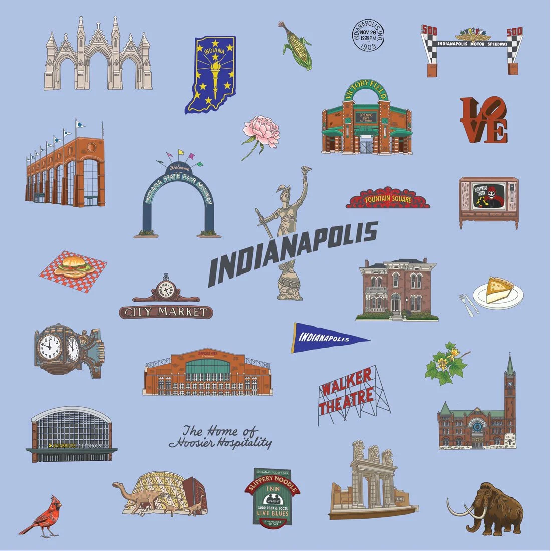
Indianapolis Icons organizes the city’s recognizable landmarks and cultural touchpoints into a cohesive illustration system designed for repeat and expansion. The collection captures both iconic architecture and everyday Midwestern details, forming the foundation for a scalable surface pattern series.
The Story
This collection began as a study of Indianapolis landmarks — from Monument Circle and the Soldiers & Sailors Monument to local signage, sports culture, and neighborhood architecture. Each element was drawn to function independently or within a structured repeat.
The repeat pattern development is currently in refinement, allowing the system to evolve into multiple scale variations and coordinated layouts suited for product, hospitality, and regional retail applications.
What's Inside
Landmarks — Indianapolis Motor Speedway gate pylons, Soldiers and Sailors Monument, Lucas Oil Stadium, Indiana State House, Cathedral Church of St. James, City Market clock tower, Indiana State Fairgrounds arch, Holliday Park Ruins, Fountain Square neon sign, Walker Theatre sign
Local History — L.S. Ayres clock, Sammy Terry on vintage TV, Slippery Noodle Inn sign, historic architecture
Indiana Pride — State flag, state outline with torch, LOVE sculpture, Indianapolis pennant
Local Flavor — Pork tenderloin, sugar cream pie, "The Home of Hoosier Hospitality" script
Natural Elements — Corn, peony (state flower), cardinal (state bird), tulip tree branch, woolly mammoth (because we found fossils here)
Pattern Development
The Indianapolis Icons collection is currently being refined into a full repeating surface pattern system. Upcoming iterations will introduce optimized spacing, multiple scale variations, and coordinated supporting prints to expand the collection’s commercial flexibility.
Colorways
Sugar Cream (Original) — Warm cream beige. The original colorway—feels like local diners and sugar cream pie. Works for products celebrating Midwest comfort and unpretentious Indy pride.
Torch Blue — State flag blue. Bold and recognizable. Perfect for products targeting Indiana pride, regional retailers, or anything leaning into official state identity.
Hoosier Gold — Warm golden yellow. Captures Indiana sunshine and cheerful Hoosier energy. Great for regional products, May merchandise, or anything celebrating local pride.
All three colorways use identical illustration systems with different background treatments, proving the pattern adapts while maintaining Indianapolis character.
Applications
Designed for:
Regional tourism merchandise
Indianapolis gift retail
Hospitality and convention-related products
Sports-adjacent merchandise
Civic and cultural branding applications
System Thinking
Each landmark was illustrated to function independently or within a structured repeat. The collection is being refined into multiple repeat scales and layout variations, allowing the system to expand into coordinated product lines and regional merchandise.
The modular structure ensures individual icons can be extracted for spot graphics, packaging, civic branding, and event-based applications while supporting future surface pattern development.
Portfolio & Licensing Note
This collection includes illustrative interpretations of Indianapolis landmarks and cultural markers. As presented, it serves as a portfolio demonstration of place-based illustration and pattern system development. The visual language and structure can be adapted for original, public-domain, or custom-developed elements for future commercial applications.
Part of a place-based pattern series celebrating destinations with distinct visual identities.

Indianapolis Icons — Sugar Cream
Additional Colorways
Indianapolis Icons — Torch Blue
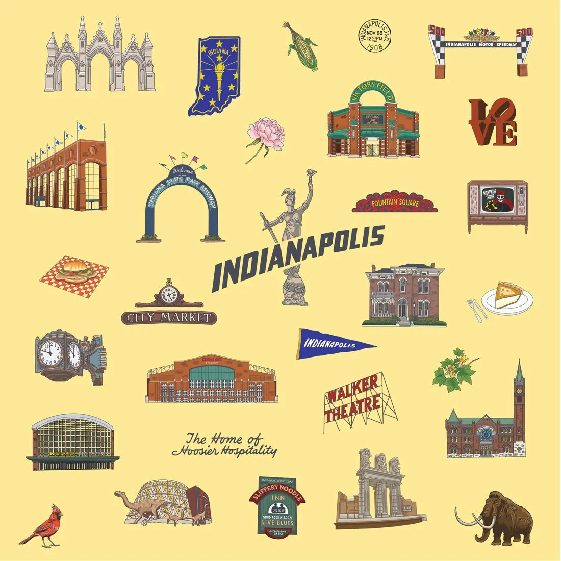
Indianapolis Icons — Hoosier Gold
Available for Licensing and Custom Application
Inquire to explore usage terms for hospitality, retail, or product design.