Building a Stronger Digital Foundation
Experience Strategy · UX Benchmarking Research · Concept Development · UX/UI Design · Accessibility · Modular Design Systems
Overview
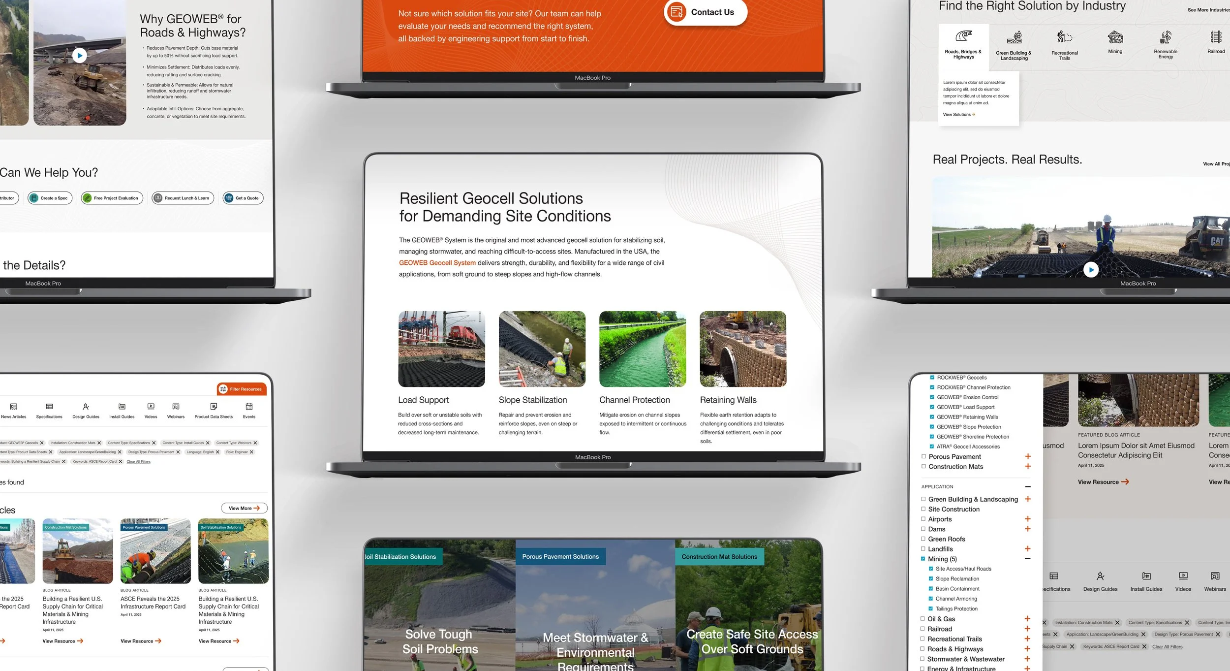
Presto GeoSystems—an industry leader in soil stabilization, porous pavements, and construction mats—needed a modern, user-focused website that could handle a vast library of technical resources while clearly presenting their innovative product lines. The redesign was driven by the goals of simplifying navigation, elevating brand presence, and making it easy for both engineers and contractors to find the right solution fast.
Strategic Thinking & Concept Development
Before moving into interface and visual design, the work focused on defining how the experience should support both technical credibility and ease of understanding across audiences.
The goal was not simply to modernize the interface, but to translate complex product information into a clearer, more intuitive experience that balanced usability, hierarchy, and long-term scalability.
Concept exploration included:
Identifying the strongest communication opportunities
Establishing content priorities and user pathways
Exploring visual directions and interaction approaches
Building a modular framework to support future growth
Aligning user needs with business and product goals
This early concept work helped shape the final experience — creating a solution that feels cohesive, intentional, and adaptable beyond launch.
Design Approach
From the start, I focused on clarity, accessibility, and scalability. The visual design uses a clean, modular system with flexible content blocks that allow Presto’s team to maintain and expand the site easily.
Key UI Principles:
Accessible typography: Sans-serif typefaces for clarity, with high color contrast ratios for legibility.
Sticky header navigation: Keeps primary actions and product categories always accessible.
Modular page design: Ensures scalability and consistency across product and industry pages.
Microinteractions: Subtle hover effects, arrow animations, and icon scaling to signal interactivity without overwhelming the user.
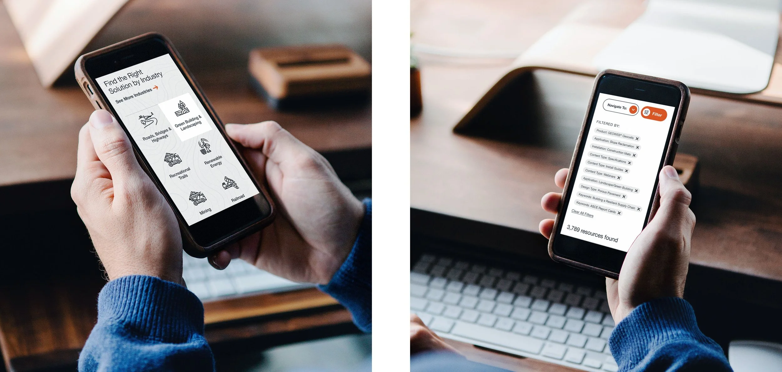
The Robust Resource Library UX
One of the most critical challenges was designing a resource hub that could house hundreds of documents, videos, guides, and case studies—and make them easy to find.
The final solution uses:
Prominent, persistent filter drawer with collapsible categories (Product, Application, Role, Content Type, Language).
Contextual labeling so users can quickly scan for the resource type (e.g., “Featured Blog Article,” “Install Guide,” “Video”).
Search + filter integration for faster results.
Clear visual hierarchy for cards, with product category color labels that match the main navigation system.
Mobile-friendly filtering to ensure the same usability across devices.
This approach turned what could have been an overwhelming list into a streamlined, intuitive experience, reducing the friction for engineers, contractors, and project owners to locate exactly what they need.
Homepage Highlights
The homepage was designed to balance brand storytelling with functional pathways:
Hero section: Strong brand statement and primary CTA.
Solution overviews: Quick visual links into key applications.
Industry gateway: Icons and quick links to guide users by sector.
Case studies & results: Showcasing real-world impact through photo-forward content blocks.
Featured resources: Pulls in high-value assets directly to the homepage to drive engagement.
UI Style Guide & Developer Handoff
To ensure consistency during development and future updates, I delivered a comprehensive UI style guide covering:
Color palette and accessibility checks
Typography styles and hierarchy
Button states and microinteraction specs
Card masks and corner radii
Product category and metadata label systems
This library was built in a separate Figma file for modular updates as later phases progressed, giving the dev team a single source of truth.
Results
The redesigned site now:
Presents a clearer, more modern brand presence.
Makes it easier for users to self-serve critical information.
Provides a scalable design system for future growth.
Streamlines resource discovery, cutting down on the time needed to find project-specific assets.
Relevance in My Portfolio
This project demonstrates my expertise in designing scalable, accessibility-focused websites for complex product ecosystems, including robust resource management tools. It’s especially relevant for clients in technical, engineering, and industrial sectors who need to organize large volumes of content without sacrificing user experience.
How this work applies to your project
If you’re planning a website or digital product redesign, this is the kind of strategic UX/UI thinking I bring to every project. Interested in working together?