Vintage Las Vegas Neon Pattern
Not Available for Licensing
Travel Illustration & Destination Pattern System. A place-based illustration system built from the iconic neon signage and golden-age casino culture of Las Vegas.
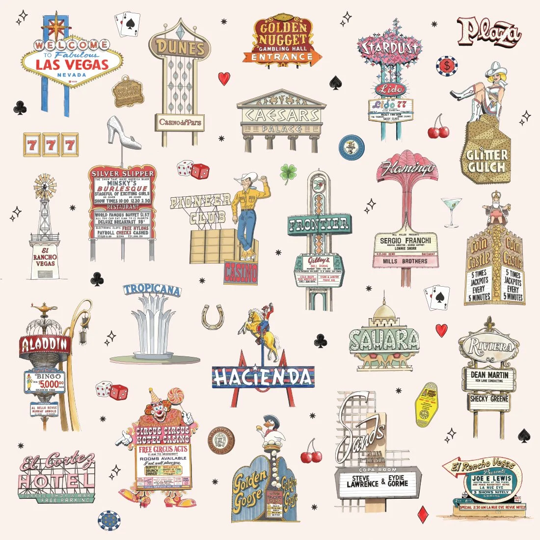
Vintage Vegas Neon translates the architecture, typography, and spectacle of mid-century Las Vegas into a cohesive surface pattern system. Each sign is hand-illustrated and organized into a repeat that balances nostalgia, clarity, and commercial flexibility.
The Story
Las Vegas was never subtle. Its skyline was built from glowing marquees, theatrical typography, oversized symbols, and showbiz bravado. Before mega-resorts and LED screens, the Strip was defined by hand-built neon and larger-than-life signage.
This collection captures that era — the Golden Nugget, Stardust, Flamingo, Hacienda, Sands, Riviera, Pioneer Club — not as a literal archive, but as an illustration system rooted in visual history. Each element was drawn to stand alone or integrate seamlessly into a repeat, preserving the spirit of vintage Vegas while functioning as a scalable pattern.
What's Inside
Iconic Signage — Golden Nugget, Stardust, Caesars Palace, Flamingo, Riviera, Hacienda, Pioneer Club, Sands, Tropicana, El Cortez, Aladdin, Dunes, Sahara
Classic Vegas Symbols — Dice, playing cards, slot reels, martini glasses, cherries, cowboy figures, neon stars, showgirl silhouettes
Architectural & Cultural Details — Marquee boards, roadside sign structures, desert-era typography, atomic-age ornament
Everything is hand-drawn with vintage linework and color detailing — recognizable, but stylized into a cohesive repeat system.
Additional Color Explorations (Not Available for Licensing)
Desert Sand (Original) — A warm beige neutral inspired by Nevada desert tones and vintage postcard stock. The most versatile version — ideal for wallpaper, textiles, hospitality merchandise, and retail accessories.
Neon Night — Deep brown inspired by the Strip after dark. The signs pop with warmth against a moody backdrop, making this version well-suited for hospitality interiors, cocktail culture, and statement décor.
Casino Gold — Bold mustard-gold that nods to classic casino interiors and sun-faded neon. Graphic and energetic, this version feels retail-ready and nostalgic.
Mid-Century Teal — A saturated teal referencing atomic-era palettes and retro travel design. This colorway leans mid-century modern and works beautifully for design-forward home goods and apparel.
Showgirl Blush — A soft vintage pink inspired by classic Vegas showgirls, marquee lights, and desert sunsets. This version warms the bold signage with a glamorous, lifestyle-forward feel — ideal for boutique retail, apparel, stationery, and hospitality décor.
All colorways use the same illustration system, allowing the collection to shift mood while maintaining visual cohesion.
Coordinate Patterns
Coordinate patterns are currently in development. Future additions will expand the system with supporting textures and scalable background motifs to allow layered product collections and broader retail application.
Applications
Currently available on:
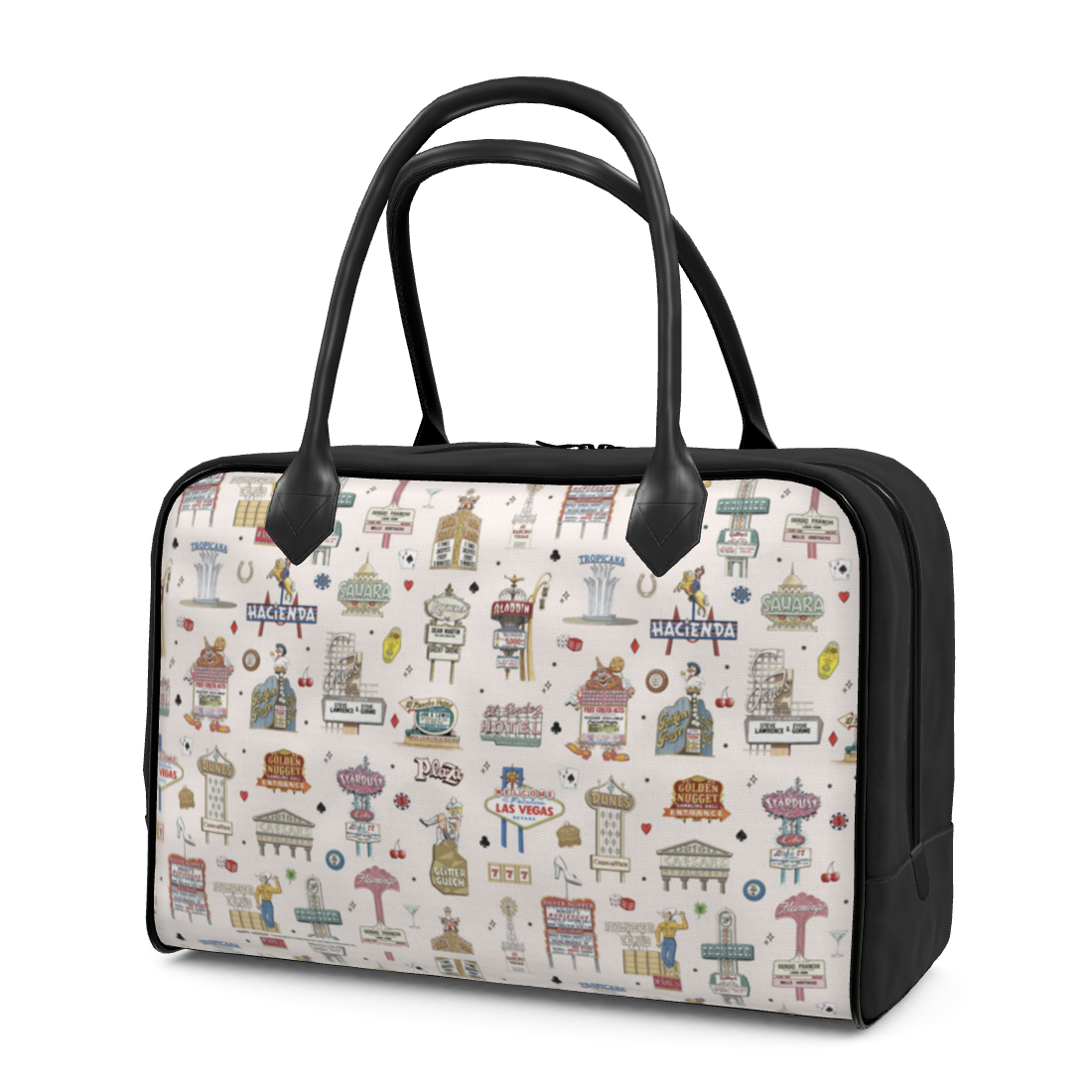
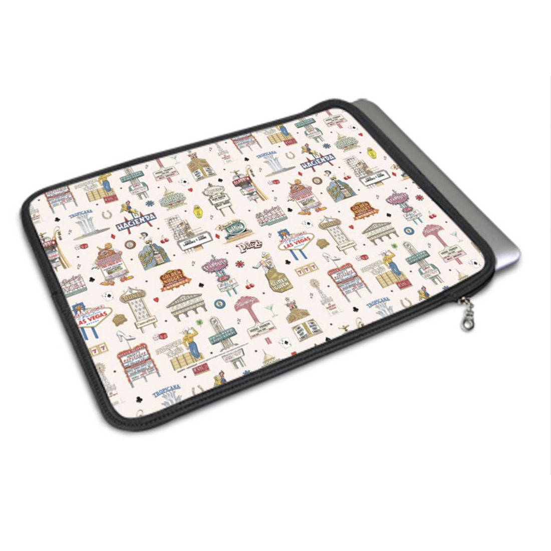
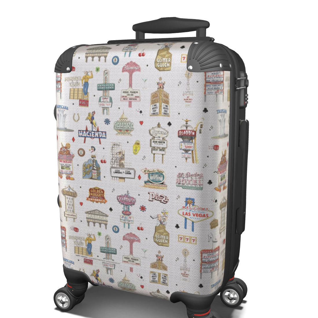
Fabric and wallpaper
Travel accessories and pouches
Art prints and lifestyle goods
Designed for:
Las Vegas gift and resort retail
Hospitality interiors and themed spaces
Americana and mid-century lifestyle brands
Travel-themed home décor
Packaging and promotional merchandise
The pattern tiles seamlessly for large-format applications. Individual signs function as standalone graphics for spot prints, apparel, packaging, and branded collateral.
System Thinking
This collection is more than a collage of vintage signs — it’s an organized illustration system. Each sign was drawn to maintain scale balance and spacing rhythm within the repeat while also functioning independently.
The modular structure allows for future adaptation, selective use of landmarks, alternate layouts, and expansion into coordinating patterns.
Why It Works
Vintage Vegas has a distinct graphic language — bold lettering, theatrical shapes, and unmistakable silhouettes. By organizing these elements into a repeatable structure, the collection preserves that energy while making it commercially flexible.
It captures nostalgia without feeling novelty-driven, making it adaptable for both souvenir retail and design-forward interiors.
Part of a place-based pattern series celebrating destinations with distinct visual identities.
Portfolio & Licensing Note
This collection is presented as a portfolio demonstration of place-based illustration and illustration system development and is not available for licensing, reproduction, or commercial use as shown.
The artwork includes illustrative interpretations of recognizable Las Vegas signage and historic brand-adjacent elements that remain subject to their respective intellectual property rights. Because of this, these illustrations and colorways will not be licensed, sold, or reproduced as a commercial collection.
The illustration style, visual system, and creative approach may be adapted in the future for original, public-domain, licensed, or custom-developed applications.
Vintage Vegas Neon — Desert Sand (Original)
Additional Colorways
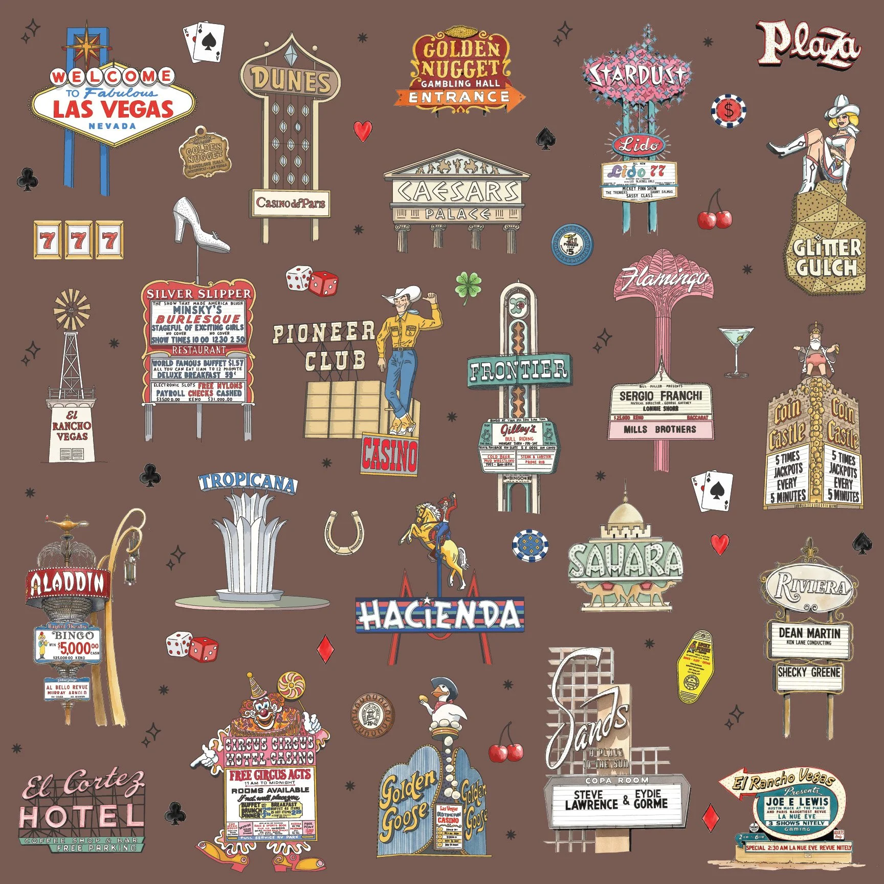
Vintage Vegas Neon — Neon Night
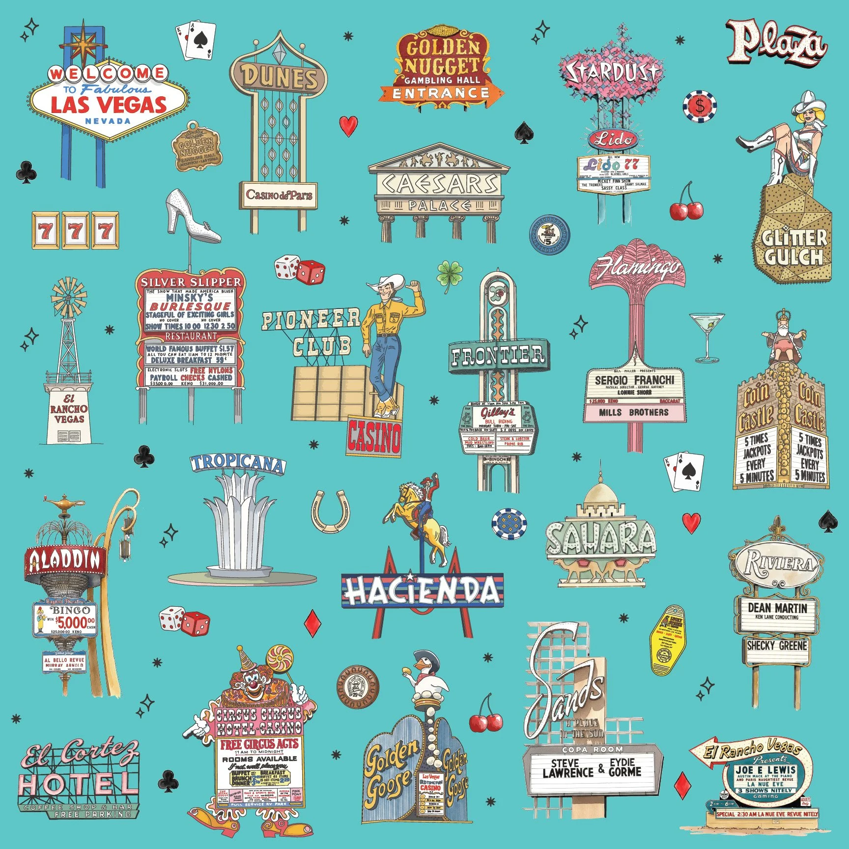
Vintage Vegas Neon — Mid-Century Teal
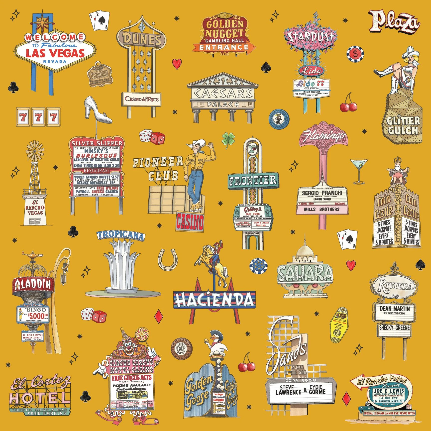
Vintage Vegas Neon — Casino Gold
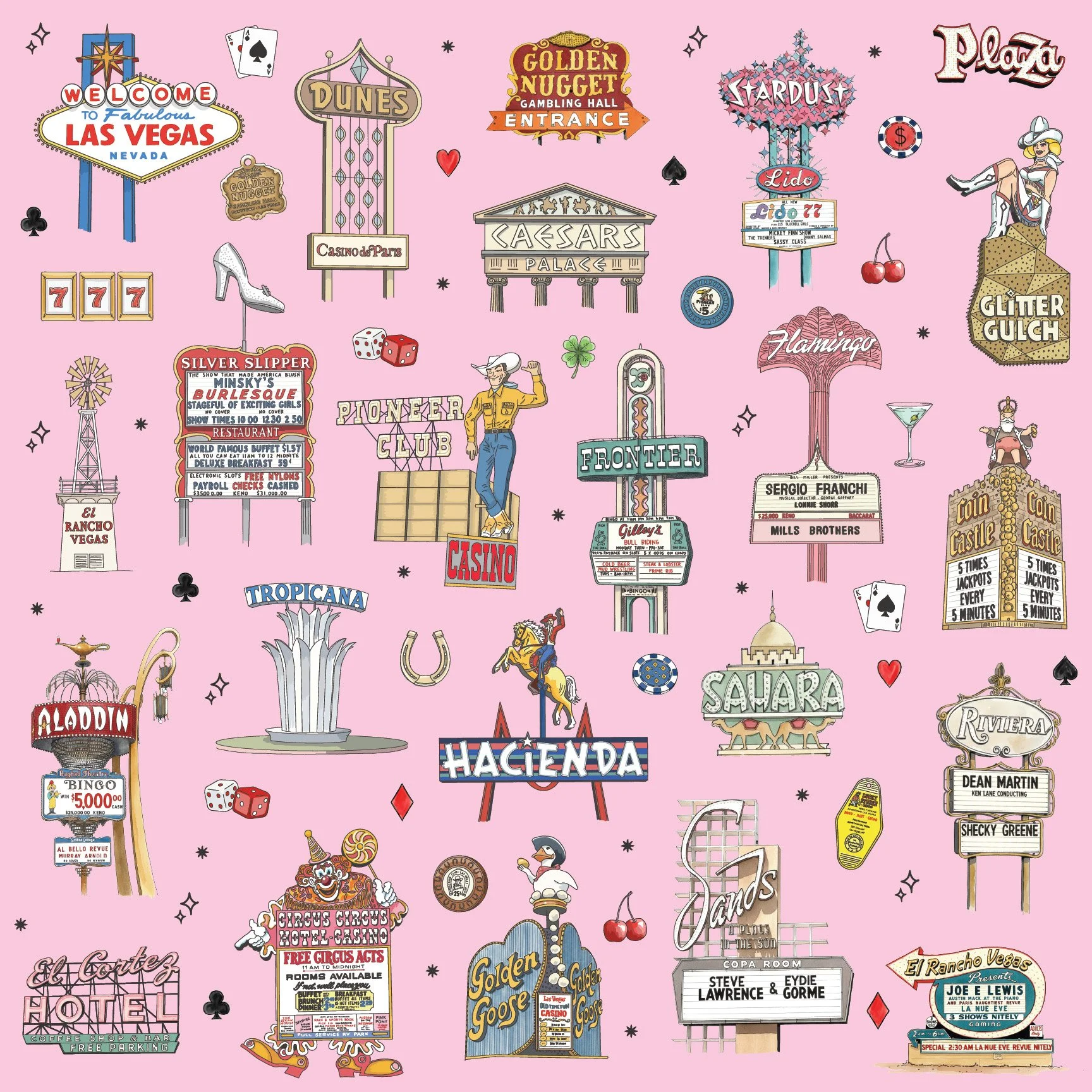
Vintage Vegas Neon — Showgirl Blush