Beyond Wayfinding Maps: Surface Pattern Design & Lifestyle Illustration for Hospitality & Resort Brands
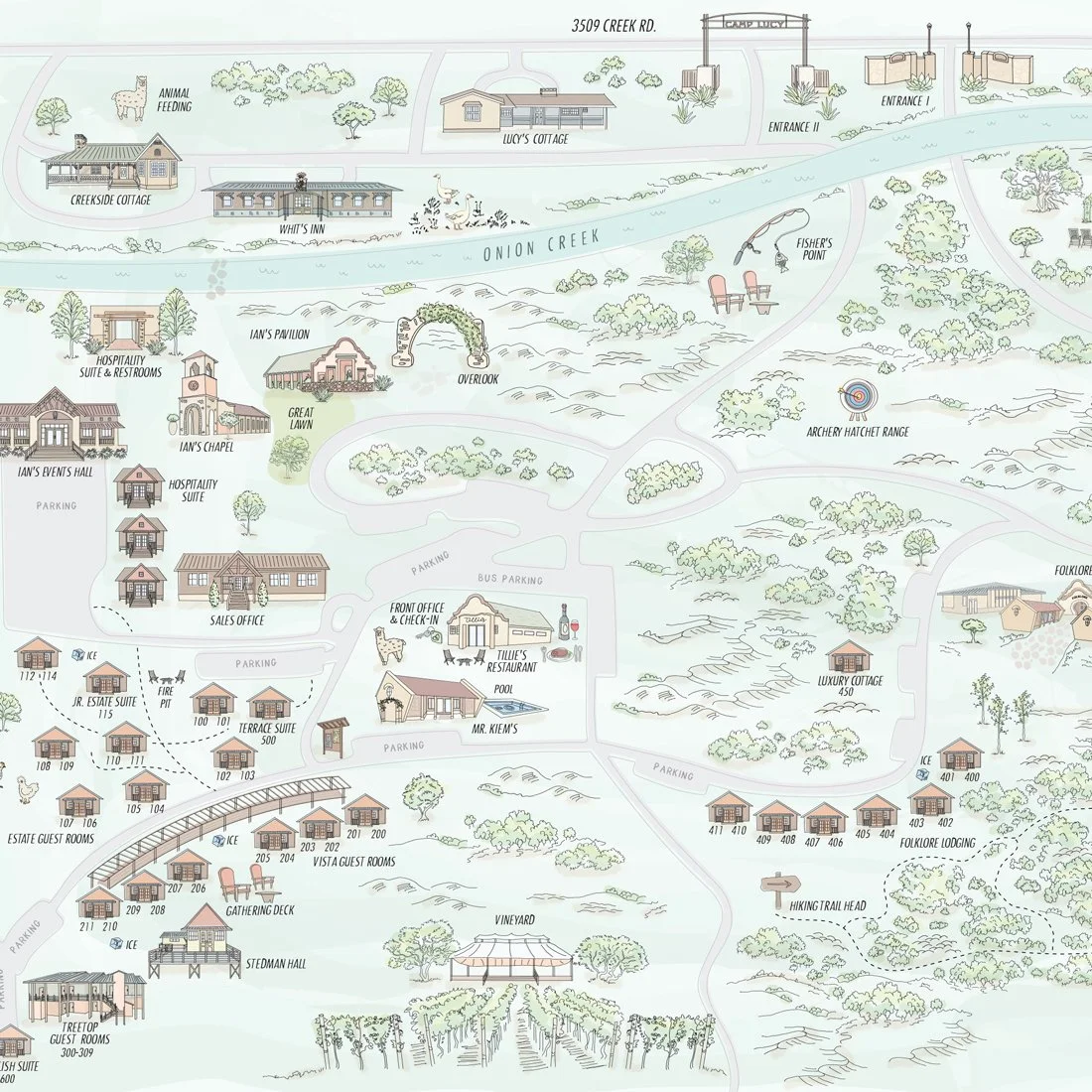
Illustrated maps have a longer life than most people give them credit for.
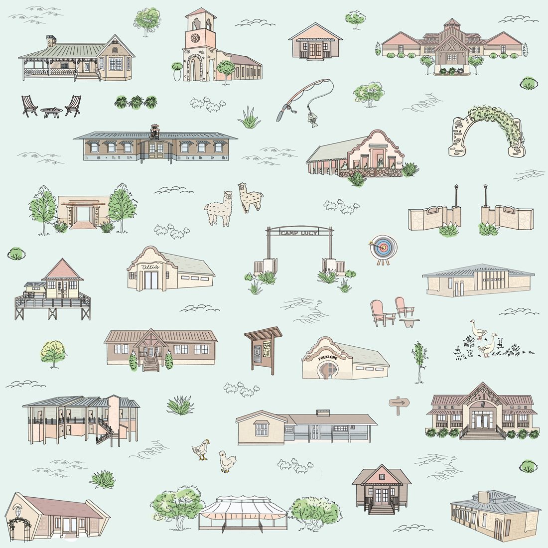
The obvious use is wayfinding — hand someone a beautiful map of your property and they know where the chapel is, where to check in, where the llamas live. (Yes, llamas. This is Texas Hill Country. There are llamas.) But once you've built an architectural illustration library for a property — every building rendered, every landmark drawn, every detail established — the natural next question is: what else can this do?
Turns out, quite a lot.
From Map to Pattern
This project started as an illustrated property map for a boutique resort and event venue. The property is the kind of place that has genuinely earned a map — multiple venues, guest accommodations, a spa, a chapel, outdoor spaces, and enough distinctive architecture that you actually need orientation when you arrive.
Once every building on the property existed as a hand-drawn illustration, the logical creative extension was to ask what happens when you put all of it into a repeat. The result is a surface pattern rendered on a soft sage ground — every venue, every accommodation, every landmark across the property, arranged into a seamless repeat that still feels like a place rather than a grid.
This is the kind of pattern that works on guest keepsakes, branded merchandise, packaging, and textiles precisely because it's specific. It's not a generic botanical or a stock pattern with the resort's name dropped on top. It's the actual property, hand-drawn, in a format that travels home with a guest and keeps working for the brand long after checkout.
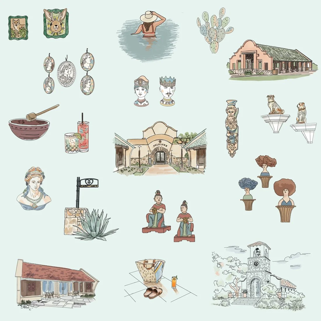
The Spa as Its Own Visual World
The resort's signature spa has a distinct identity — eclectic, curated, layered with artisan objects and a sensory aesthetic that doesn't quite match anything else on the property. Which meant it deserved its own illustration treatment rather than being folded into the property pattern.
The lifestyle illustration exploration developed for the spa draws from its visual personality directly: the architecture of the spa building itself, artisan objects, botanicals, and the kind of quiet, specific vignettes that capture what it actually feels like to be inside the space. A drink on a tile surface. Objects arranged the way a careful eye arranges things. The building rendered with enough detail that a guest would recognize it immediately.
This kind of system — a flexible illustration toolkit built around a specific hospitality experience — supports branded collateral, spa menus, retail packaging, and environmental applications without requiring a new illustration every time something needs a visual.
Why This Matters for Hospitality Properties
Most resort merchandise looks like resort merchandise. A logo on a tote. A stock botanical on a candle. Nothing wrong with it, but nothing memorable about it either.
The properties that get this right treat their visual identity the way they treat their physical spaces — with specificity, with intention, and with the understanding that a guest's experience of a brand doesn't end when they leave the property. A hand-drawn pattern that's actually of the place is a guest keepsake that doubles as a marketing asset. It's the kind of thing people keep.
Illustrated maps are often where this conversation starts for hospitality clients. But the illustration library built for a good map is the foundation for a lot more than wayfinding — surface patterns, lifestyle illustration systems, branded merchandise, environmental graphics, and collateral that holds together because it was all drawn from the same visual language.
If you're managing a property with a strong sense of place and you've been thinking about what your branded merchandise could actually look like, this is the conversation worth having.
All work shown is a creative exploration developed independently. Inquire about surface pattern and lifestyle illustration for hospitality properties, resorts, and event venues.