All Signs Point to Vegas: A Vintage Illustration Pattern
Las Vegas in the mid-20th century had a very specific design philosophy: if you couldn't read it from a moving car at 60 mph, it wasn't big enough.
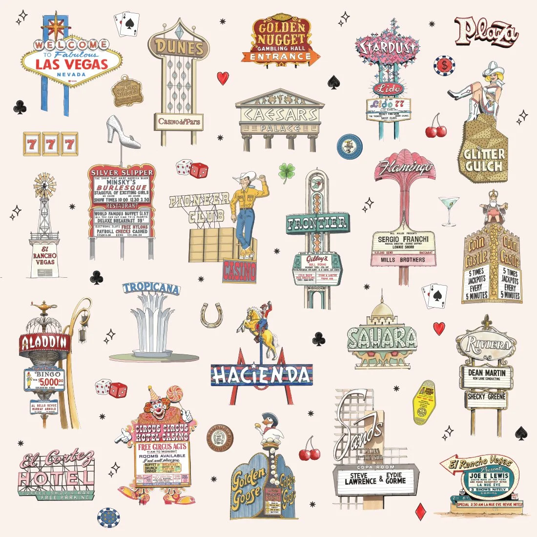
This pattern is a collection of vintage Vegas signage from the era when the Stardust, the Sands, and the Flamingo were competing to see who could mount the most lightbulbs on a single structure. Spoiler: everyone won.
What's Actually In Here
The Welcome to Fabulous Las Vegas sign (obviously). Caesars Palace doing its best Roman Empire impression. The Stardust's atomic-age starburst. The Flamingo in full pink neon glory.
Also: the Golden Nugget, the Dunes, the Tropicana fountain, the Frontier, the Sahara, the Riviera (featuring Dean Martin and Shecky Greene), the Hacienda's cowboy-on-a-horse, Circus Circus promising free circus acts, the Silver Slipper, Binion's Horseshoe, the Sands (back when it was Steve Lawrence & Eydie Gormé), El Rancho Vegas, and Glitter Gulch.
Plus: Vegas Vic (the 40-foot tall waving cowboy), a showgirl, playing cards, poker chips, dice, lucky horseshoes, cherries, martini glasses, and the kind of script lettering that requires at least four different neon tubes to execute properly.
Every sign here believed in itself completely. No minimalism. No restraint. Just confidence, bulbs, and the absolute certainty that bigger was always better.
Why Signs Work as a Pattern
Vegas signs weren't trying to blend in. They were competing for attention from a highway full of people driving through the desert looking for entertainment.
That means each one had to have personality—distinct shapes, typography that wouldn't quit, color choices that made sense only in a place where "too much" wasn't a concept.
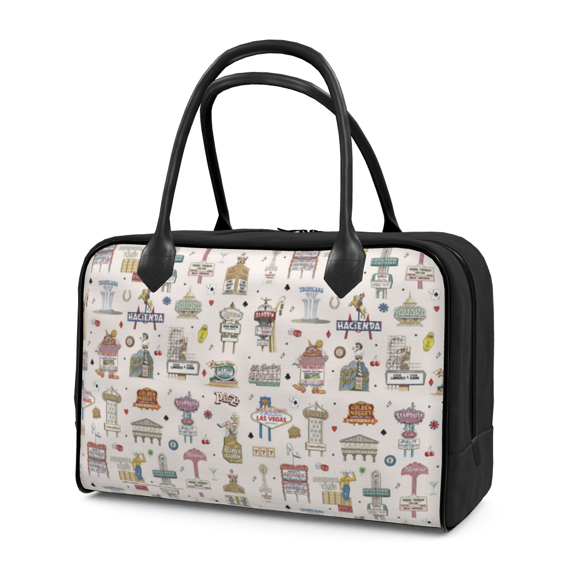
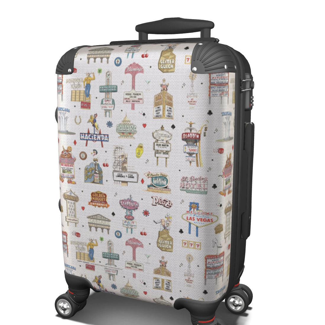
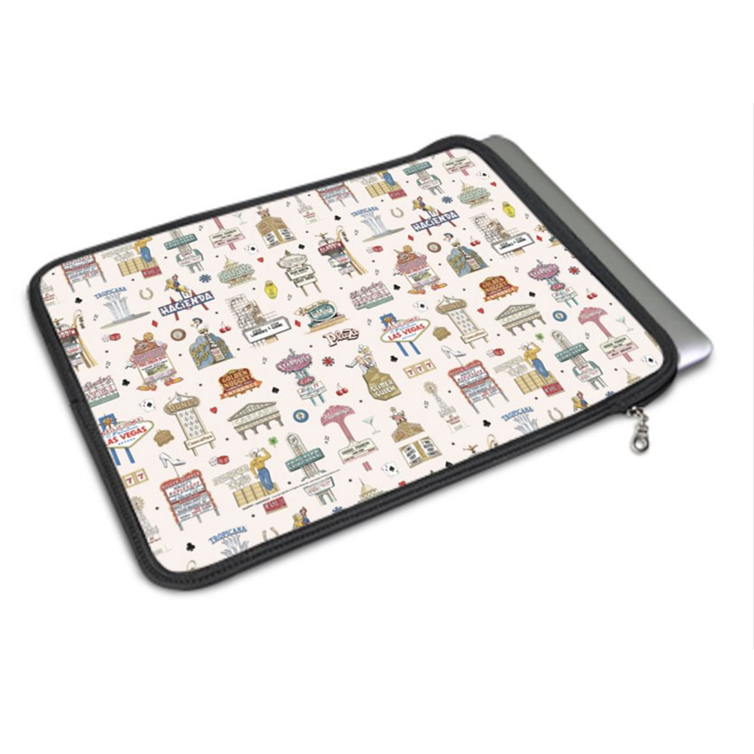
Drawing them as individual elements and then tiling them into a pattern lets each sign keep its moment while creating something that feels like the Strip itself: overwhelming, but somehow it all works together.
What You Can Do With It
This works for anyone who needs vintage Americana with actual attitude. Hospitality projects, retro branding, packaging that wants some mid-century swagger, textiles that understand the assignment.
The full pattern tiles seamlessly. Individual signs work as standalone elements. The whole thing scales without losing detail.
It's designed for products, spaces, and brands that want vintage Vegas energy without literally putting a slot machine in the lobby.
Part of a Bigger Thing
I'm working through a series of place-based illustration patterns—destinations that have strong visual identities and enough personality to fill a repeating pattern. Vegas just happens to come with built-in drama and a 50-year archive of spectacular signage decisions.
Still in production. More patterns coming soon.