Bavaria-ish: An Illustrated Stroll Through Frankenmuth
There are charming towns… and then there’s Frankenmuth — Michigan’s not-so-secret portal to Bavaria, complete with lederhosen-level commitment and a Christmas store so big it could probably be seen from space.
If you’ve never been, picture this:
You’re driving through the Midwest, minding your own business, and suddenly—Bavarian architecture. Everywhere. Timber framing. Gingerbread trim that looks one strong gust of wind away from singing “Edelweiss.”
And that’s before you even reach Bronner’s, the “Largest Christmas Store in the World,” which is basically a glittering labyrinth of ornaments where time (and your budget) cease to exist.
A Tiny History Lesson, Served With Warm Pretzel Energy
Frankenmuth was founded in 1845 by Bavarian settlers looking for religious freedom and farmland, bringing with them the kind of old-world charm that now defines the town’s entire personality.
The name itself means “Courage of the Franconians.” Which raises the question: What level of courage is required to build an entire Bavarian village in Michigan? Answer: enough to commit to the bit for 175+ years — and honestly, respect.
About the Illustration Collection
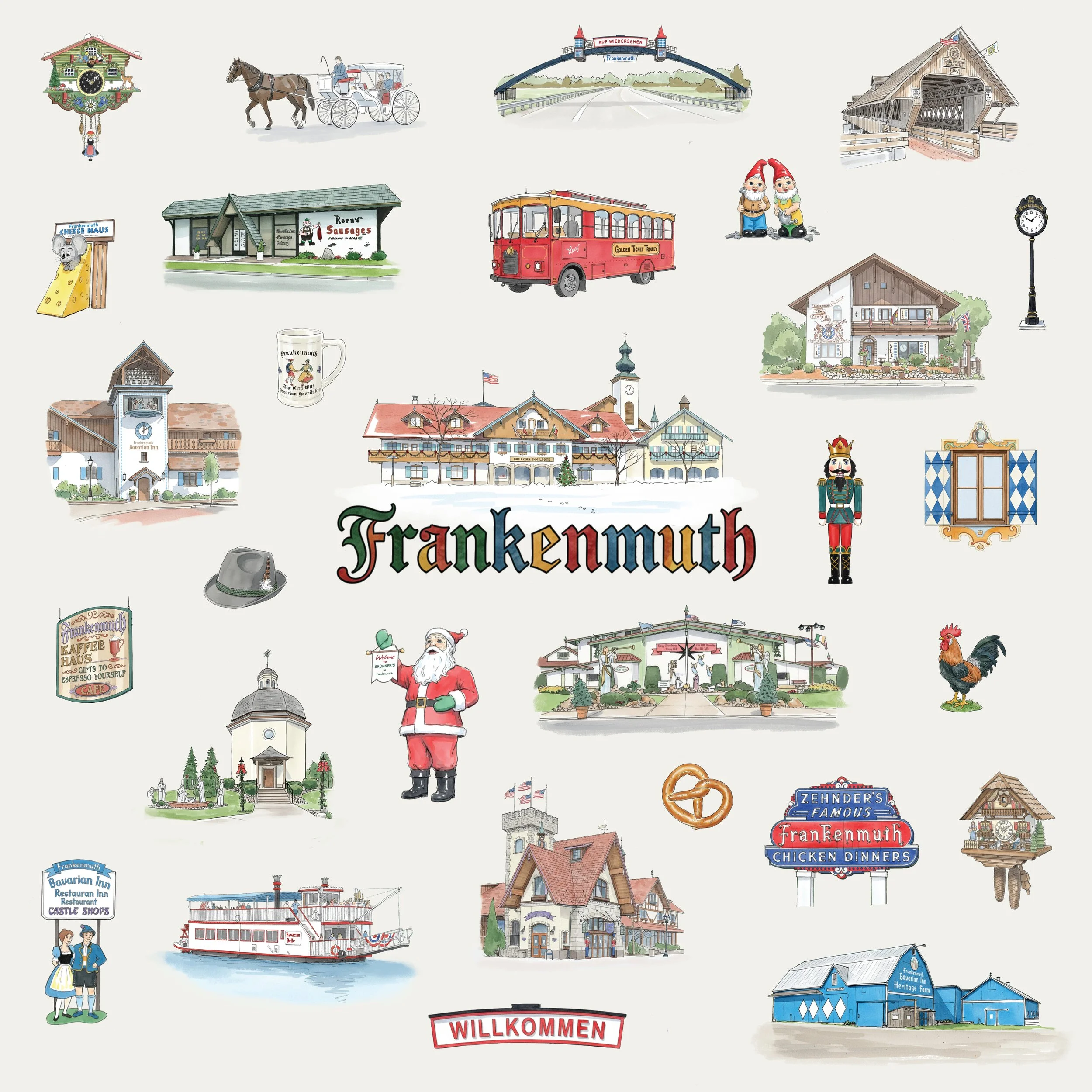
This Frankenmuth pattern celebrates everything that makes the town impossible to resist: the iconic covered bridge, the Bavarian Inn, the trolley, the carved shop signs, the architecture, the pretzels. The chicken dinners that require a post-meal nap. And the theming so committed that even Disney might say, “Alright, tone it down.” It’s part history, part kitsch, part cozy nostalgia — and that combination makes it an illustrator’s dream.
Each vignette is drawn with soft linework and watercolor-inspired detail to capture the feeling of wandering the town on a sunny afternoon — the kind where every building seems fully aware of its own photogenic potential.
It’s charming. It’s quirky. It’s unmistakably Frankenmuth.
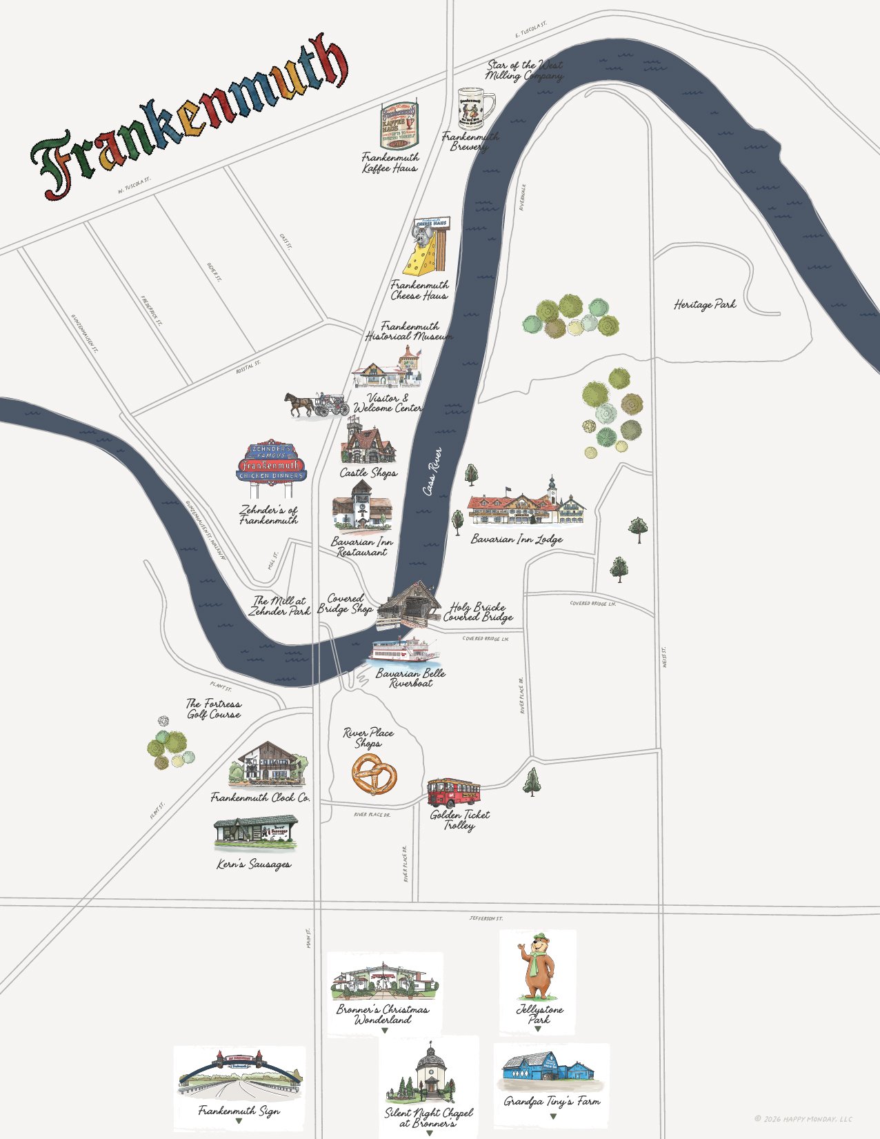
From Pattern to Place: Expanding the System
The original Frankenmuth collection started as a surface pattern—an exploration of icons, motifs, and moments that define the town’s character.
But as the collection grew, something became clear:
This wasn’t just a pattern.
It was a system.
So the next step felt inevitable—bringing those illustrated elements back into the context they came from.
A Frankenmuth Illustrated Map, in Progress (Laying the Foundation)
This illustrated map is still in its early stages—and right now, the focus is purely on structure.
At this point, I’m not refining style or adding detail. I’m working through the underlying framework:
Establishing the street layout and overall geography
Determining scale and spacing across the full map
Placing key landmarks in their correct relative positions
Testing how elements cluster and flow together
The goal here is to get everything accurately mapped and balanced before moving into illustration and visual refinement.
Why Start This Way
Even though the final piece will feel expressive and hand-drawn, the foundation needs to be solid.
This phase is about answering questions like:
What actually belongs on the map?
What gets illustrated vs. simplified or omitted?
How dense should the experience feel?
Where does the eye naturally travel?
It’s less about decoration and more about composition, hierarchy, and clarity.
Building Toward the Final System
Because this map is part of a larger illustration system, these early decisions matter.
The way landmarks are placed, grouped, and scaled will directly influence:
How the final map reads at a glance
How well it aligns with the pattern collection
How easily elements can be reused across formats
Once the structure is locked in, the next phase will be layering in:
Illustrated landmarks
Color and texture
Typographic details and labeling
Small moments of personality that bring the map to life
But all of that sits on top of what’s happening here first.
Why This Stage Matters
This part of the process isn’t the most visually exciting—but it’s one of the most important.
Because once everything is in place, the illustration becomes intentional instead of decorative.
And Here’s the Fun Part…
If seeing this collection makes you think, “Wait… could you illustrate my town?” The answer is a very enthusiastic yes.
Whether it’s a coastal village, a historic square, a tourist district, or a place with one diner, one lighthouse, and one extremely proud statue of something…
there’s always a visual story worth telling.
This Frankenmuth set is just one example of how wonderfully a place can translate into illustration — equal parts memory-making, story-sharing, and “I need this on a tea towel.”