The Fork & Spoon — Brand Identity
Logo Design · Illustration · Brand System
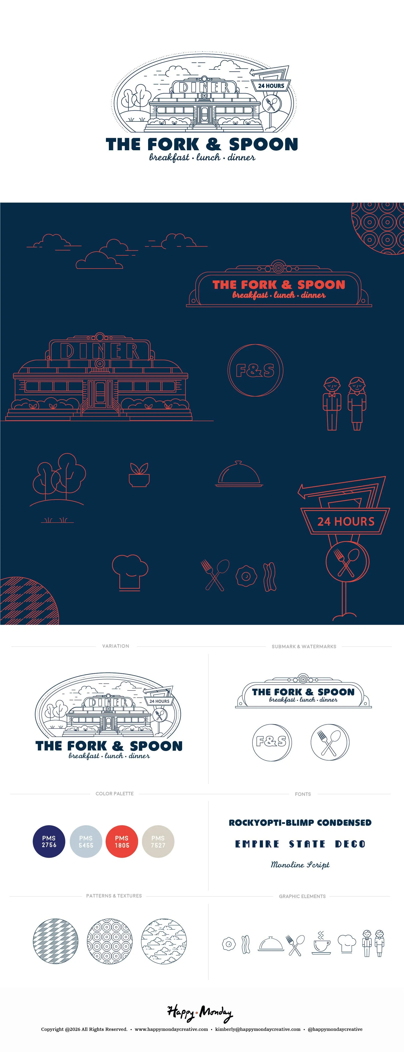
Some brands want to feel timeless. The Fork & Spoon wanted to feel like you'd been eating there your whole life — the kind of place with a neon sign out front, a counter full of regulars, and pie that's been on the menu since 1953.
Building that feeling from scratch takes more than a font choice. It takes a complete visual language.
The identity system is built around a suite of custom monoline illustrations — the diner building itself, a retro roadside sign, a chef's hat, a cloche, silverware, a fried egg, and a cast of characters including the staff who keep the place running. Every element drawn in the same tight, clean line weight so they work together whether they're on a takeout bag, a t-shirt, or a to-go cup.
The color palette leans into the era: deep navy, warm red, and a muted blush that keeps the palette from tipping into costume. The typography pairs a bold condensed display face with a stacked deco headline and a monoline script — three distinct voices that somehow all sound like the same brand.
The brand board pulls it all together: master logo, alternate lockups, sub-marks, watermarks, color swatches, type specs, patterns, textures, and the full icon library. Everything a team needs to launch consistently and stay that way.
Quirky without being chaotic. Retro without being a parody.