
Kyou Masu — Brand Identity for a Wellness & Fitness Brand
Logo Design · Brand Identity · Icon Design · Pattern Design · Brand Board
Wellness is one of those categories where every brand looks the same — muted neutrals, sans-serif everything, a lotus flower if you're lucky. Kyou Masu decided to do something different.
Built around the philosophy of wellness, fitness, and balance, Kyou Masu is a fitness trainer and lifestyle brand built for Instagram — the kind of account that posts at 5am because that's when the work actually starts, and whose aesthetic is as disciplined as the training it promotes. The brand needed to reflect that energy: focused, vibrant, and distinctly its own.
The Work
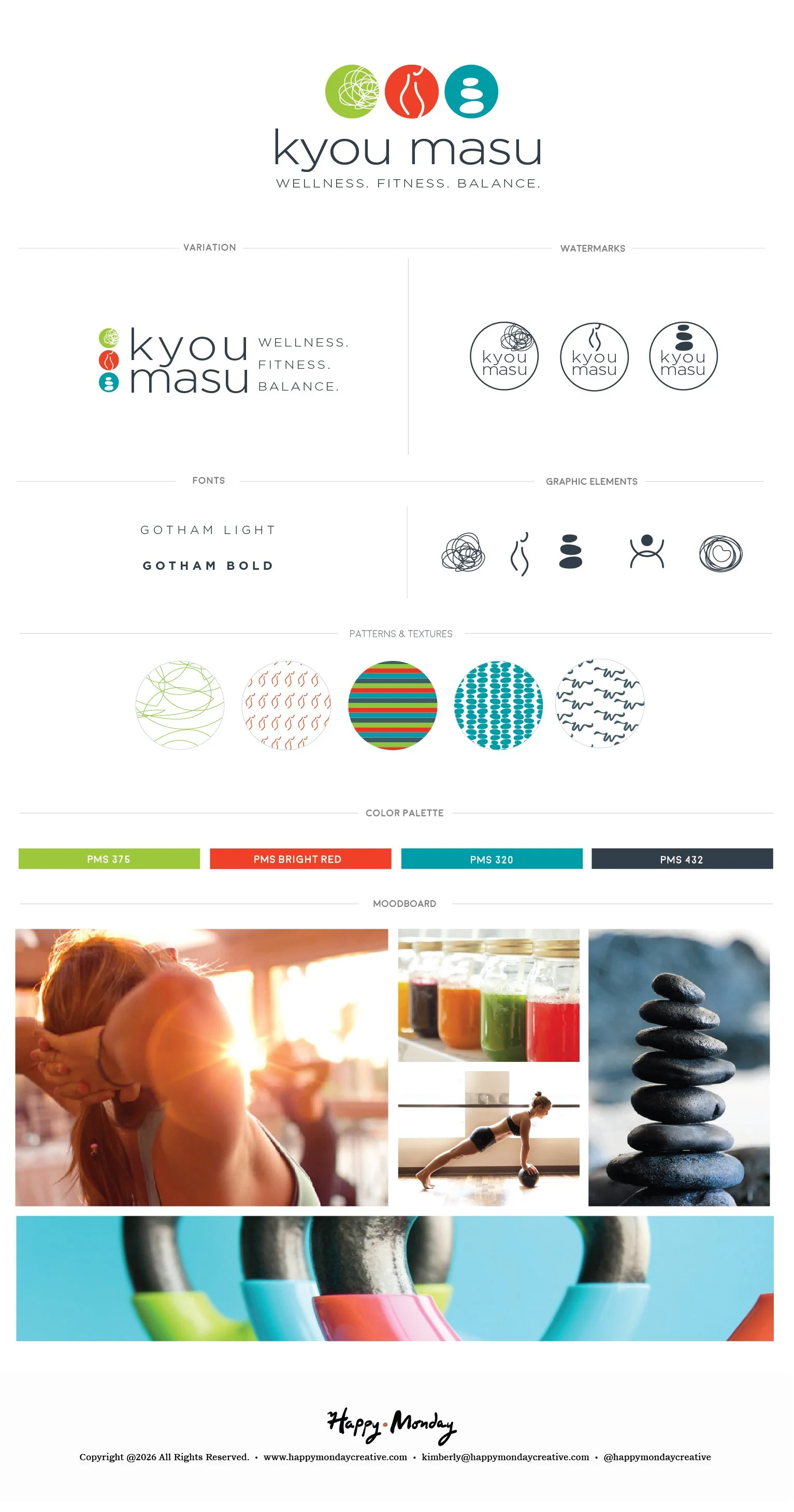
The logo leads with three circular icons stacked side by side — a tangled line suggesting mental clarity through chaos, a flame figure in motion, and a stack of balanced stones — each representing one pillar of the brand: wellness, fitness, balance. Together they read as a unified mark. Individually, each holds its own as a standalone icon, giving the brand enormous flexibility across social, merch, and digital applications.
The wordmark kyou masu sits beneath in clean lowercase — grounded, confident, unhurried. The tagline Wellness. Fitness. Balance. punctuates it with intention.
The color palette is the brand's most unexpected move: electric green, bright red, teal, and near-black. Bold, saturated, unapologetic. In a category drowning in sage and blush, this palette stops the scroll.
The pattern library builds on the graphic element system — tangled line work, flame figures in repeat, bold stripes, dot grids, and organic mark-making — five distinct patterns that give the brand a rich visual texture across every surface. The icon set extends the system further: five hand-drawn marks that distill each brand concept into a single gesture.
The moodboard captures the full world: golden hour workouts, rainbow juices lined up on a counter, a yoga pose mid-flow, kettle bells in a row, stacked stones at the water's edge. High energy. High intention.
The Result
A wellness brand that actually has a point of view — and a visual identity bold enough to hold it.
Wellness. Fitness. Balance.
Interested in building a brand with this kind of depth?
If you're building something that needs a mythology behind it — not just a logo — this is the kind of work I love most.