Little Sea Islands Sun Club
Branding · Illustration · Pattern Design
The Myth Before the Mark
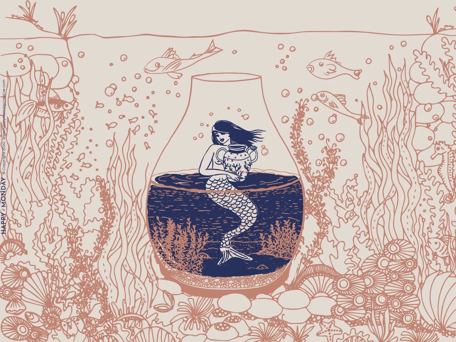
Every coastline has its legends. Little Sea Islands Sun Club began with one — the kind of story that feels like it was always there, waiting to be illustrated. A mermaid, not swimming free in open water, but trapped inside a glass jar on the ocean floor, cradling her underwater treasures. Mysterious. A little melancholy. Completely captivating.
That image — the mermaid in the jar — became the creative anchor for everything that followed. It nods to the old cartographic tradition of sea monsters and mythical creatures drawn at the edges of maps, where the known world ended and imagination took over. It borrows from pirate mythology and the romance of sunken treasure. And it carries its own quiet poetry:
When she sang amid the glisten Of her sheeny golden hair
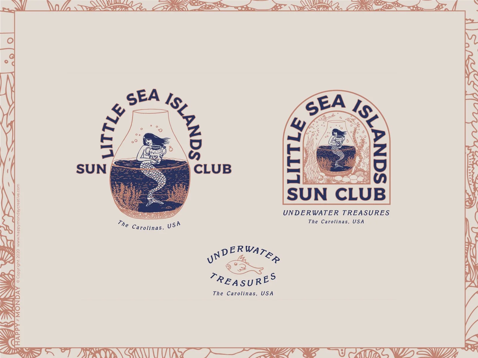
From Illustration to Identity
The work began with the large illustration — the mermaid suspended in her glass vessel, surrounded by seagrass, fish, sea creatures, and the soft debris of the ocean floor. The detail is dense and unhurried: jellyfish drifting in the margins, seahorses half-hidden in the weeds, coral blooming along the bottom. It's the kind of illustration you keep finding things in.
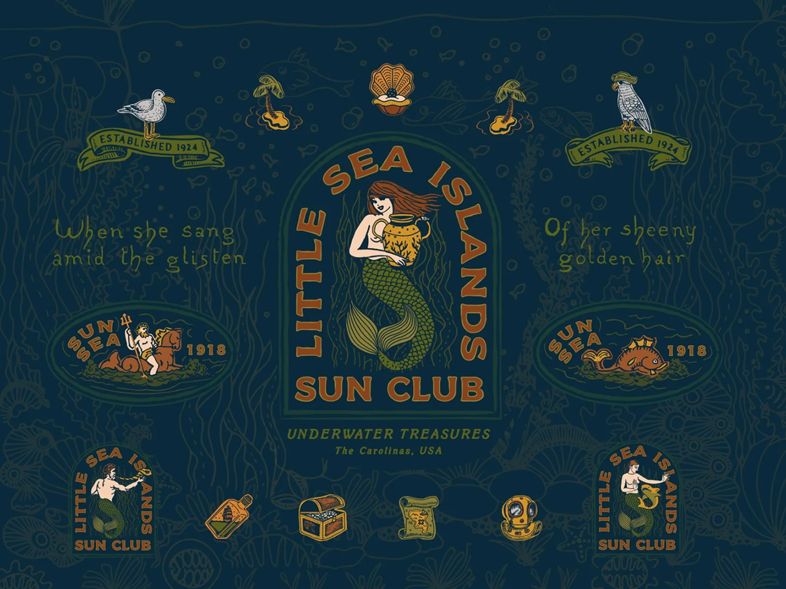
From there the system grew outward — logo badges, mark variations, graphic elements, and a repeating brand pattern. The Sun Club concept gave the brand a second layer: part mythological, part mid-century leisure club, the kind of place established in 1918 that would have had a crest and a motto and a very good reason to exist near the water.
Two Palettes, One Evolution
The brand moved through two distinct colorways as the exploration developed. The illustration and brand pattern live in deep navy, hunter green, burnished gold, and terracotta — rich, saturated, the colors of old maps and weathered nautical flags. As the work shifted toward logo badges and mark variations, the palette softened: blush and dusty rose replaced the terracotta, and the navy pulled back into something quieter. Same world, different light — the difference between standing on the dock at noon and standing there at dusk.
The Pattern as Mythology
The brand pattern doesn't just repeat — it world-builds. Logo badges, illustrated icons, and typographic fragments scatter across a deep navy field like artifacts washed up from the same shipwreck. A Neptune figure on horseback. A crowned fish. A seagull on a banner reading Established 1924. A treasure chest, a message in a bottle, a diver's helmet, a treasure map. The Carolinas, USA. Underwater Treasures. It reads less like a brand pattern and more like evidence — as if Little Sea Islands Sun Club really existed, and these are the things it left behind.
Interested in building a brand with this kind of depth?
If you're building something that needs a mythology behind it — not just a logo — this is the kind of work I love most.