Alliance Housing — Minnesota Toile Pattern
Custom Illustration · Pattern Design · Brand Application
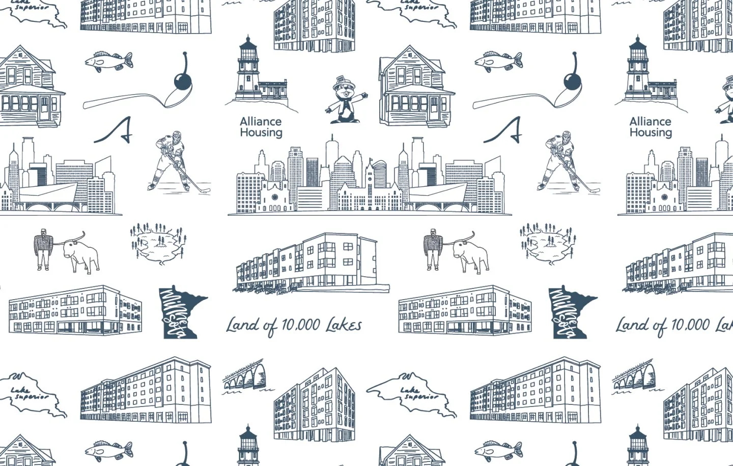
The Brief
Not every pattern starts with a mood board and a creative brief. This one started with a mission. Alliance Housing is a Minneapolis-based nonprofit dedicated to providing stable, supportive housing for people experiencing homelessness — and they wanted their visual identity to reflect a genuine sense of place. Not a generic skyline. Not stock illustration. A pattern that was rooted in their community, their buildings, and the city they serve.
The Toile Approach
Toile de Jouy — the centuries-old French textile tradition of intricate single-color scenic illustration — turned out to be the perfect vehicle. The style is inherently place-based and storytelling in nature, built on the idea that the things around us are worth looking at closely and rendering with care. For a housing organization, that felt exactly right. These aren't just buildings. They're homes. They're neighborhoods. They're the reason the organization exists.
The illustration style leans into that tradition: fine line art, no fill, everything rendered in a single ink color against a clean background. Detailed without being dense. Quiet without being empty.
Place as Pattern
The challenge was weaving two things together seamlessly — Alliance Housing's own properties alongside the iconic landmarks and vernacular architecture of Minneapolis and Minnesota. A hockey player mid-stride. A loon on open water. A lighthouse. The Minneapolis skyline. Fish. The words Land of 10,000 Lakes nested into the repeat like a caption on an old print.
The result is a pattern that functions on two levels simultaneously: it's a brand asset and a love letter to place. Residents, donors, and community members can look at it and find themselves in it.
Application
Designed for flexibility across web backgrounds, print materials, and packaging — the pattern scales from a subtle texture to a bold full-bleed statement depending on the application. At any size, it reads as distinctly Minnesotan and distinctly Alliance.
Interested in building a brand with this kind of depth?
If you're building something that needs a mythology behind it — not just a logo — this is the kind of work I love most.