Mysterio Magicians
Branding · Illustration · Pattern Design
The Brief That Wrote Itself
Some concepts arrive fully loaded. Mysterio Magicians — world famous, positively astonishing, established 2009, Greater New York Show — walked in with its own mythology already intact. The work wasn't to invent a brand so much as to excavate one: to find the visual language that had always belonged to it and pull it into the light.
The Reference Point: Pulp, Comics, and the Back Page
The aesthetic direction came from a very specific place — those glorious, slightly unhinged ads that lived in the back pages of mid-century comic books. X-ray specs. Sea monkeys. Magic kits. Ads that sold you a world in two square inches, rendered in rough hand-drawn linework with just enough grit to feel like they'd been printed on a press that had seen better days. That's the energy Mysterio needed: nostalgic, theatrical, a little carnival-barker, completely committed to the bit.
Building a Cast of Characters
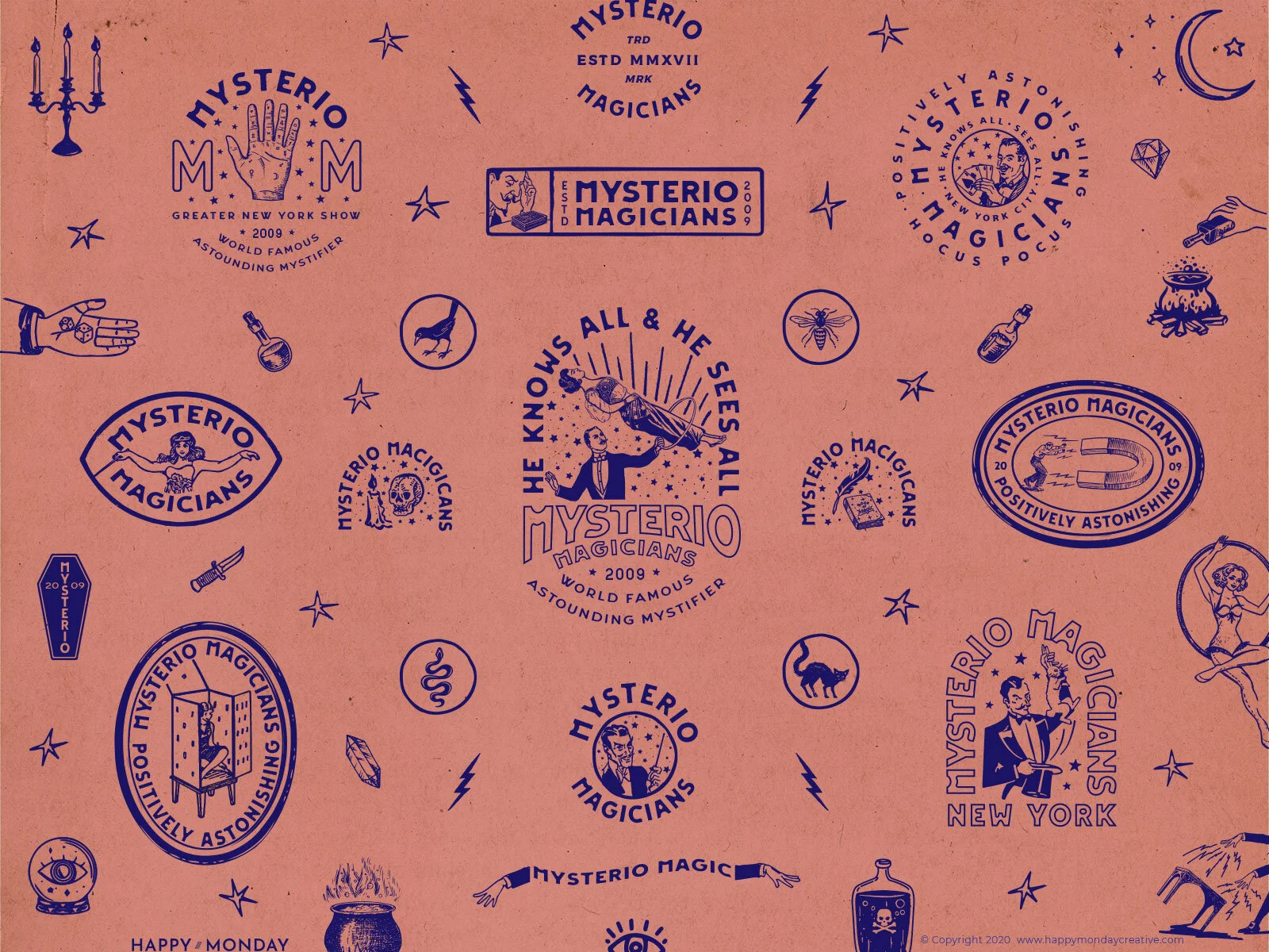
What makes a brand pattern work isn't repetition — it's richness. Mysterio's pattern is populated: a magician levitating his assistant, a fortune teller's eye, a crystal ball, a raven, a bee, a snake, a cauldron, a coffin, a candelabra, poison bottles, daggers, diamonds, lightning bolts, a crescent moon. Every element is a clue. Every element belongs. The illustration style is deliberately rough and hand-drawn — slightly imperfect lines, the kind of texture that implies a printing plate worn smooth from overuse. Nothing is too clean. Clean would be wrong.
Two Colors. No Apologies.
The palette is a single bold statement: deep navy on warm terracotta. It's the color story of old carnival posters, letterpress broadsides, and vintage packaging that spent a few decades in a dusty drawer. The constraint is the point — two colors forces every illustration to earn its place through line quality and composition alone, with no color complexity to hide behind.
Brand Pattern as Identity System
There's no traditional brand board here — no color chips, no font specimens, no logo lockup grid. Instead the identity lives entirely in the pattern: a dense, all-over repeat of logo badges, illustrated icons, and typographic elements that together function as the complete brand world. It's a different way of proving a system — not by laying the parts out side by side, but by showing what happens when they all inhabit the same space at once. The result feels less like a brand sheet and more like wrapping paper for a magic show.
Interested in building a brand with this kind of depth?
If you're building something that needs a mythology behind it — not just a logo — this is the kind of work I love most.