Reel Photography — Brand Identity & Brand Board
Logo Design · Brand Identity · Illustration · Icon Design
Photographers are some of the hardest clients to brand. They have an eye for everything — composition, color, proportion, the tiniest detail that's slightly off — and they're not shy about saying so. Building a brand for a photographer means the work has to be as considered as the images they make.
Reel Photography needed an identity that felt personal and polished without trying too hard — the kind of brand that attracts clients who value artistry over assembly-line portrait studios.
The Work
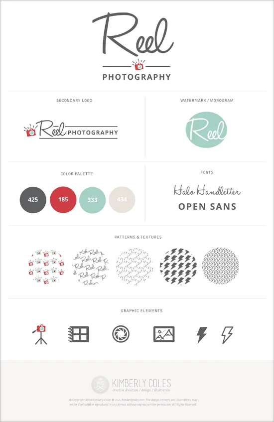
The logo leads with a flowing script wordmark — Reel — paired with a small camera detail nestled into the letterform, and anchored by a clean sans-serif "PHOTOGRAPHY" beneath. It's feminine without being precious, modern without chasing a trend. The secondary lockup gives the brand a horizontal option that works cleanly across social headers, watermarks, and any surface where the full stacked logo is too much.
The supporting system is where the brand gets its texture. A set of custom patterns — camera motifs, delicate repeat graphics — gives the brand a surface language that can travel across packaging, client welcome materials, and digital touchpoints. The icon library covers the working vocabulary of a photography business: a flash, a shutter, a film strip, a print, an award ribbon. All drawn in a consistent style that ties the system together.
The color palette — deep charcoal, coral red, soft teal, and warm blush — is confident and considered, with enough warmth to feel approachable and enough sophistication to signal quality.