Seas the Day — Brand Identity & Illustration
Custom Illustration · Brand Identity · Pattern Design
The Brief
Some briefs arrive with a vibe so specific you can practically smell the sunscreen. Seas the Day — Original Gulf Coast Island Resort, Est. 2015 — wanted a brand identity rooted in the golden era of the American beach vacation. The motor lodges with the kidney-shaped pools. The postcards with the illustrated pin-up. The matchbook you tucked into your pocket as a souvenir. That world, but done with enough restraint and craft to feel fresh rather than costume.
The challenge was to tap into that nostalgia without drowning in it. Beach themes are everywhere. Retro beach themes are even more everywhere. The work had to earn its vintage references rather than just borrow them.
The Matchbook Effect
The defining creative decision was the print treatment. The illustrations were rendered with a deliberate matchbook quality — slightly rough, slightly overprinted, the kind of texture that implies a two-color press run on a good day and a questionable one on a bad day. It gives everything a tactile, physical quality that clean digital illustration simply can't fake. You look at it and you believe it could have been printed in 1962 and slipped under a glass at the tiki bar.
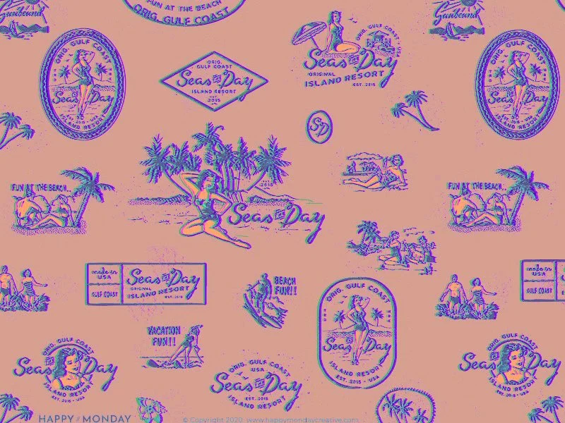
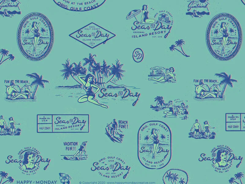
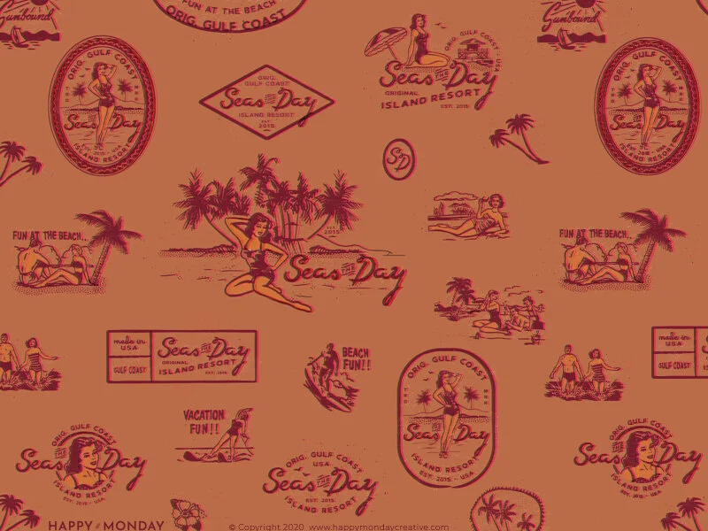
A Palette That Shouldn't Feel Like the Beach — But Does
This is where the brand really separates itself. The obvious palette for a Gulf Coast beach brand would be turquoise and coral, maybe a sandy neutral. Seas the Day went somewhere more interesting: three distinct colorways — a terracotta and deep crimson, a warm salmon and violet-blue, and a minty teal and cobalt — all mid-century in feeling, all unexpected for the category. The palette shifts across applications without losing coherence, like flipping through a stack of vintage postcards from the same place in different light.
A Pattern That Packs Up and Goes
The brand pattern brings the full asset library into one dense, joyful repeat: logo badges in multiple configurations, pin-up figures on the beach, palm trees, beach scenes, surfboards, a swimmer under a resort umbrella, "Fun at the Beach," "Vacation Fun!!," "Sunbound," "Beach Fun!!" — the slogans of a simpler era rendered with genuine affection. The SD monogram stamp. The diamond badge. The oval portrait. Every element is a postcard from somewhere you want to be.
Interested in building a brand with this kind of depth?
If you're building something that needs a mythology behind it — not just a logo — this is the kind of work I love most.