Wee Bit Lucky — Brand Identity
Logo Design · Brand Identity · Illustration · Icon Design
Some brands are built for billboards. Wee Bit Lucky was built for the scroll — a personal brand designed to stop thumbs and build a following from the ground up.
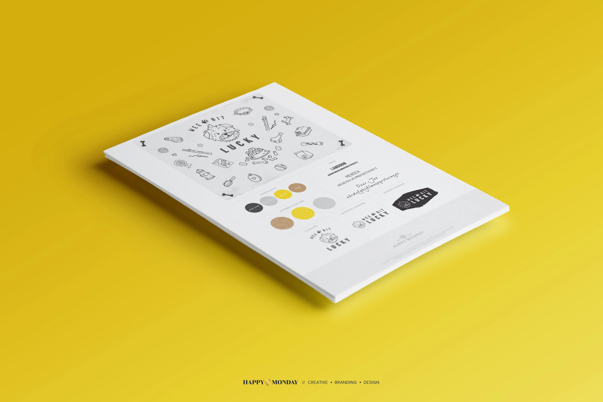
The identity is anchored by a hand-drawn illustrated logo featuring a scrappy, lovable terrier rendered in a style that's equal parts charm and personality. Surrounding it is an extensive icon library — bones, bowls, toys, treats, leashes, paw prints — all drawn in the same loose, confident line work that gives the brand its handmade warmth. It's the kind of illustration system that feels personal because it is.
The color palette keeps things sunny and grounded — golden yellow, warm tan, cool gray, and black — cheerful without being cartoonish, and versatile enough to work across every format a social-first brand needs to show up in.
The brand board pulls the full system together: primary logo, alternate lockups, watermark, color palette, and the complete illustration set — everything needed to launch with consistency and grow with intention.