What Vintage Matchbook Covers Taught Me About Storytelling Through Illustration
A while back I found myself completely distracted by vintage matchbook covers. Not the rare collector pieces. Not the famous ones. The weird local ones.
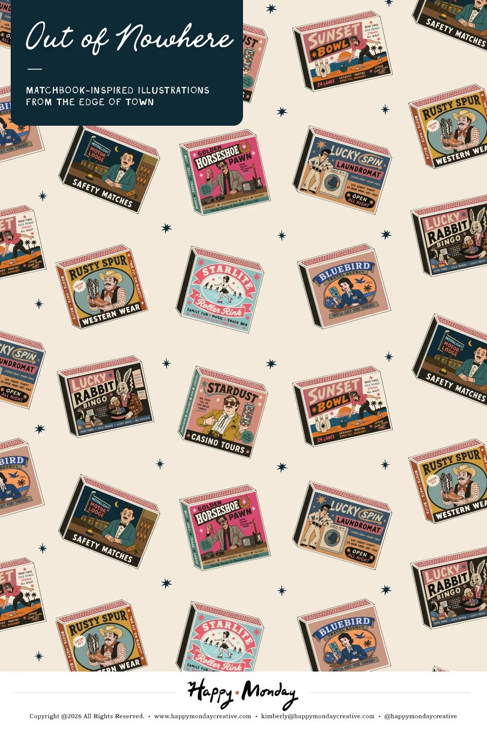
The bowling alley. The motel. The western wear shop. The bingo hall. The pawn shop. The laundromat that somehow looked more interesting at midnight than it did during the day.
The more I looked at them, the more I realized that most of them weren't particularly beautiful. The illustrations were often simple. The typography could be awkward. The printing was usually limited to a few colors. Many were produced on small budgets and designed to do one thing: get people through the front door.
What fascinated me wasn't the quality of the artwork. It was how little information these tiny advertisements needed to be memorable. The best matchbooks weren't trying to explain everything. They simply gave you enough information to become curious. Looking through them, I found myself wondering what the businesses were actually like. Was the motel clean or barely hanging on? Was the bowling alley packed every Friday night or mostly empty? Was the western wear shop a local institution or just another stop along the highway? The matchbook never answered those questions, but somehow it encouraged you to ask them.
Eventually I became less interested in the businesses themselves and more interested in the formula. What would happen if I used the same visual language to advertise businesses that never existed? That question became the foundation for this collection.
Rather than recreating vintage matchbooks, I started inventing my own businesses and designing matchbook covers for them. A bingo hall built around luck. A laundromat with a name that sounded like it belonged in neon. A roller rink, a pawn shop, a western wear store, a motel, and a casino tour company that might promise more than it can deliver.
As the collection grew, the illustrations started to feel connected. Not because they were based on real places, but because they shared the same ingredients: memorable names, quirky mascots, roadside charm, and just enough personality to make you wonder if the business might actually exist somewhere.
In the end, that's probably what I admire most about vintage matchbooks. They weren't trying to be masterpieces. They were practical little advertisements designed to be carried in a pocket, left on a bar, or forgotten in a kitchen drawer. Yet many of them managed to create a stronger sense of identity than campaigns with infinitely larger budgets.
Because sometimes the thing that makes a business memorable isn’t what it sells. It’s the rabbit, the horseshoe, the neon sign out front, and the strange little reason you looked twice.
Curious what those fictional businesses look like?
Explore the complete Out of Nowhere Matchbook Illustration Collection →