
What started as a little exploration into the wonderfully quirky world of ham radio exchange cards has turned into an ongoing illustration series. And the more I create, the more possibilities I find.
The original QSL cards from the 1950s through the 1970s were full of personality. Some were funny, some were downright strange, and others were wonderfully ordinary. What I love most is that they weren't trying to be great works of art. They were personal calling cards, often featuring exaggerated characters, unusual nicknames, favorite pastimes, and little glimpses into someone's life.
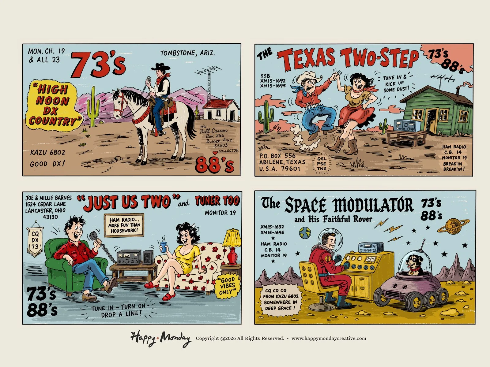
For this latest collection, I've continued inventing fictional radio operators and giving each one a personality and a story. There's a little bit of everything, from Western adventures and two-stepping cowboys to domestic humor and even an imaginary space explorer with his faithful companion.
Each card is its own little world.
The illustration style is just as important as the characters. I'm drawn to the imperfect hand-lettering, bold colors, playful compositions, and slightly awkward charm of vintage commercial illustration. Nothing was overly polished, and that's part of what made these cards so memorable.
I also love how typography becomes part of the storytelling. Oversized names, scattered call signs, handwritten messages, and the familiar "73's" and "88's" all compete for attention in the best possible way.
There's something refreshing about creating illustrations that don't take themselves too seriously. These cards give me an opportunity to experiment with character design, typography, composition, and humor while celebrating a small but fascinating piece of graphic design history.
There are still plenty of fictional personalities, oddball situations, and little slices of Americana waiting to become QSL cards.