The Everywhereist — Brand identity and UX/UI design for a globally recognized travel blog
Brand Identity · UX/UI Design · Illustration · Icon Design · Design Strategy
Some blogs are just blogs. The Everywhereist is something else entirely — a narrative travel site built around one woman's voice, her marriage, her opinions on snacks, and her refusal to take any of it too seriously. Founded by Geraldine DeRuiter, the site has been named one of TIME magazine's top 25 blogs, landed in Forbes' top 10 lifestyle sites for women, and been featured on Oprah.com, CNN, Flipboard, and USA Today Travel. It was even included as one of 10 well-designed blogs in Blog Design for Dummies.
The Challenge
When a blog gets that kind of attention, the visual identity has to work as hard as the writing. The Everywhereist needed a cohesive brand system that captured Geraldine's voice — sharp, warm, irreverent, deeply personal — while functioning as a real design system across web, social, and editorial contexts.
The Work
The engagement covered the full brand ecosystem: identity strategy, logo design, typography system, color palette, custom illustration, icon design, and UX/UI design for the site itself.
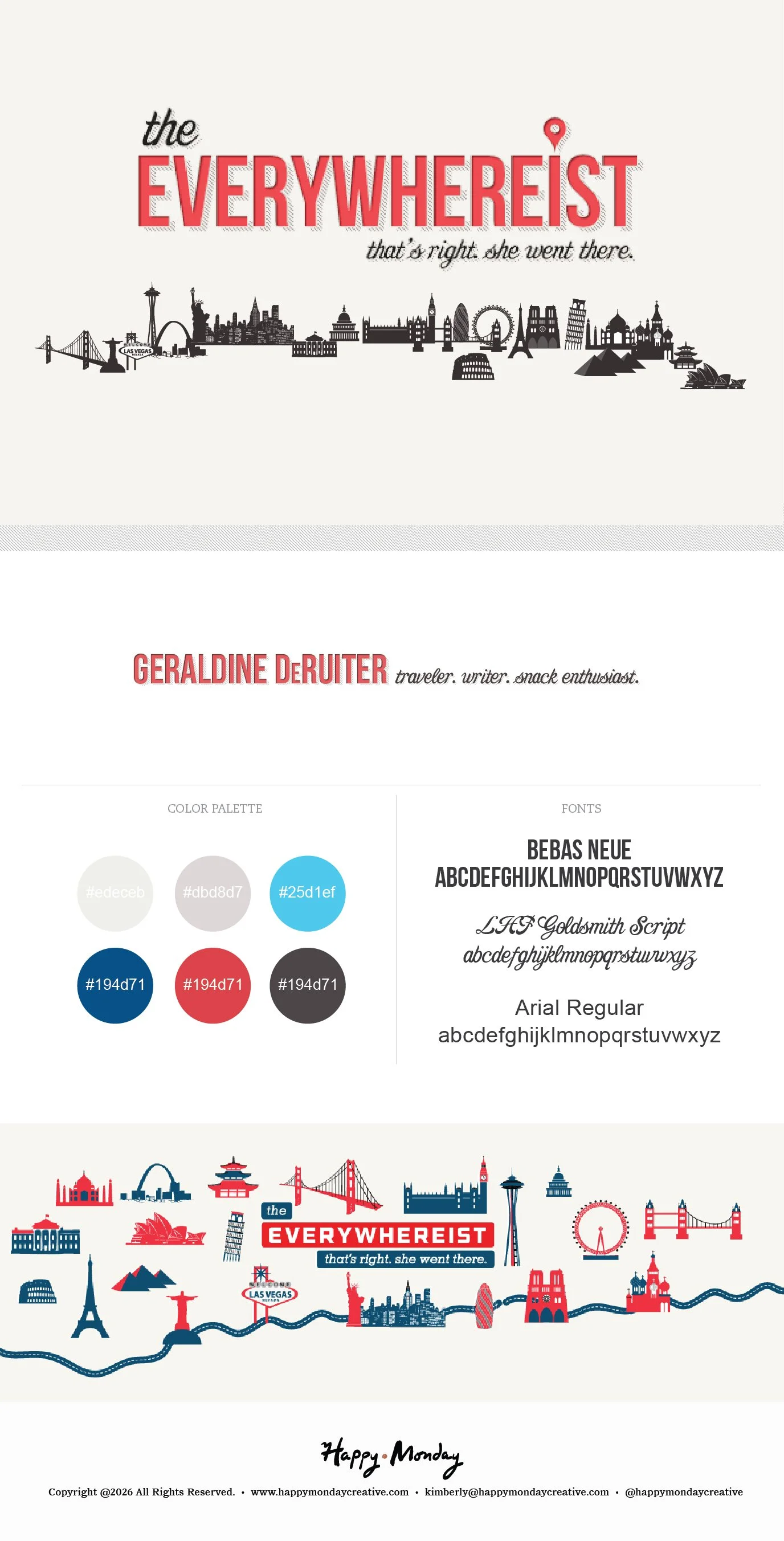
The logo centers on a bold oversized wordmark paired with a map pin detail that earns its place — specific enough to signal travel, restrained enough to not be a cliché. The tagline that's right. she went there. does the rest of the personality work.
The illustration system is where the brand really comes alive. A panoramic world skyline stretches across the header — the Golden Gate Bridge, the Eiffel Tower, Big Ben, the Space Needle, the Sydney Opera House, the Colosseum, the Taj Mahal — all rendered in a graphic silhouette style that balances editorial polish with a sense of adventure. The same landmark icons were developed as a standalone set, giving the brand flexible visual assets that could travel across every surface.
The color palette — bright red, deep navy, sky blue, and warm neutrals — is classic Americana with a passport stamp. Bold enough to own the page, clean enough to let the writing breathe.
The UX/UI design brought it all together into a site experience that feels as intentional as the brand: clear navigation, strong typographic hierarchy, and a layout that keeps the focus on what matters — Geraldine's stories.