Kitty Attack Blog — Brand Identity, Illustration & Interactive Web Design
Logo Design · Illustration · Sitemap · Wireframes · UX/UI Design · Interactive Design
Long before viral marketing had a playbook, someone had the idea to sell health insurance through a grumpy cat with a military complex and a grudge against humanity. That someone needed a designer willing to go all the way in. That designer was me.
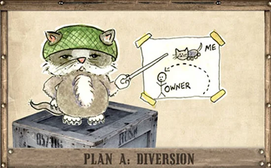
Kitty Attack Blog was a social media campaign and illustrated blog built for The Insurance Store — a health insurance resource site — back in 2008, when social media experiments were still genuinely experimental. The concept: General Grover Cleveland, a devious feline strategist, blogs about his ongoing battle against humanity, posts video footage of his attacks, illustrates his battle plans, and recruits minions from across the internet to submit ideas for future operations. Hidden underneath all of it: a completely legitimate prompt to get a free health insurance checkup.
It was absurd. It was brilliant. It worked.
The Work
The engagement covered everything from concept through launch — sitemap, wireframes, logo design, illustration, and full web design and interactive build. The logo is hand-lettered chaos in the best possible way: a military-helmeted cat glowering from inside the letter O, surrounded by the kind of typography that looks like it was designed by someone who just knocked a cup of coffee onto their keyboard. On purpose.
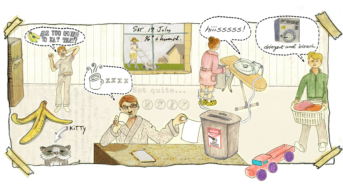
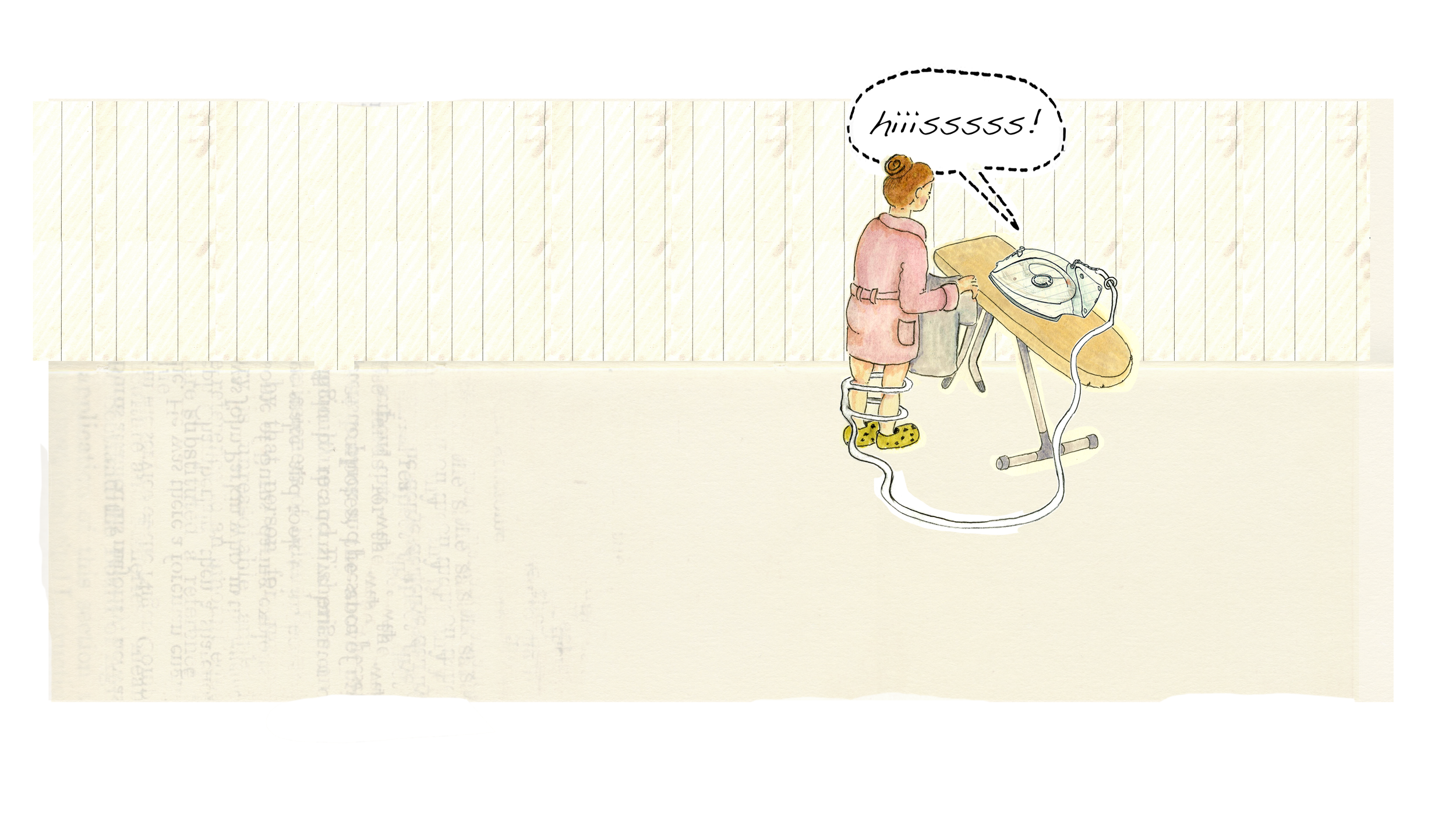
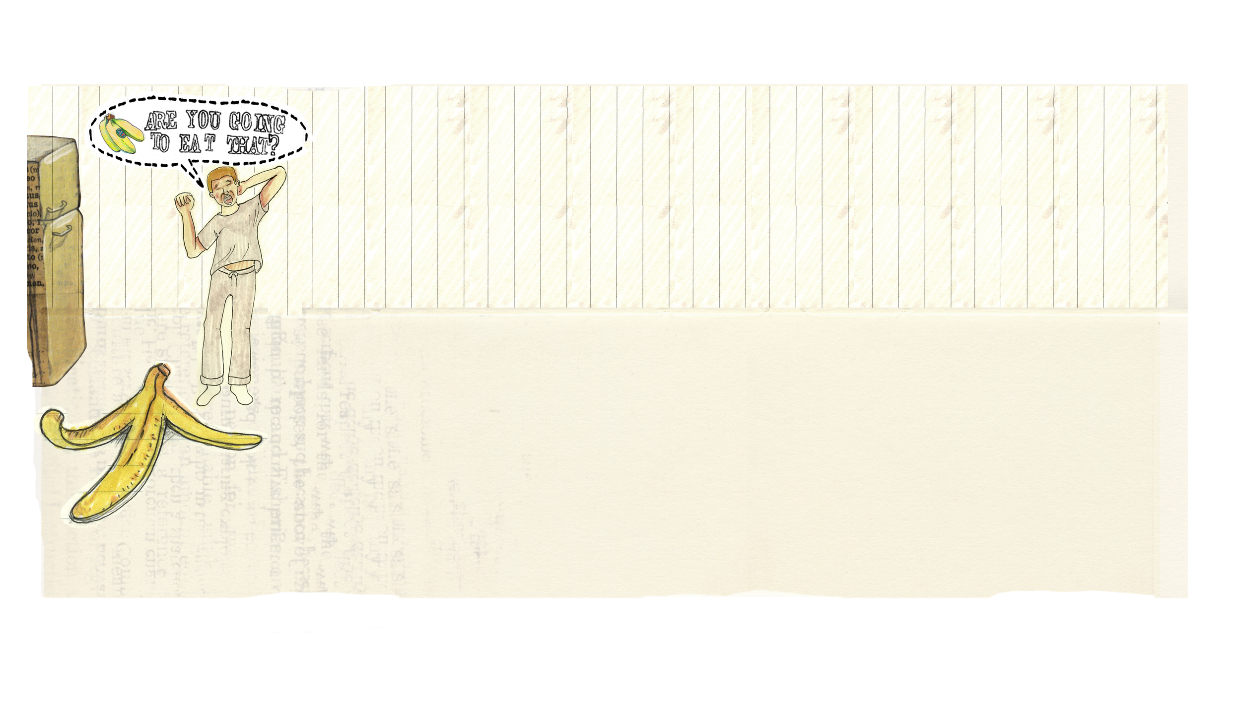
This unique website was created to explore one of life unanswered questions - what’s the worst thing that could happen if you decide to go without health insurance? The website and blog needed to reinforce the need for insurance, even among young and financially struggling individuals. The initial concept was to create an entertaining marketing piece that starred one sneaky cat and several uninsured, unsuspecting victims. The handdrawn look and feel came about when it was suggested that cats secretly draw up battle attack plans before sabotaging their owners. The accompanying video spots illustrated the unexpected ways in which health insurance comes in handy to help younger individuals with its new line of plans.
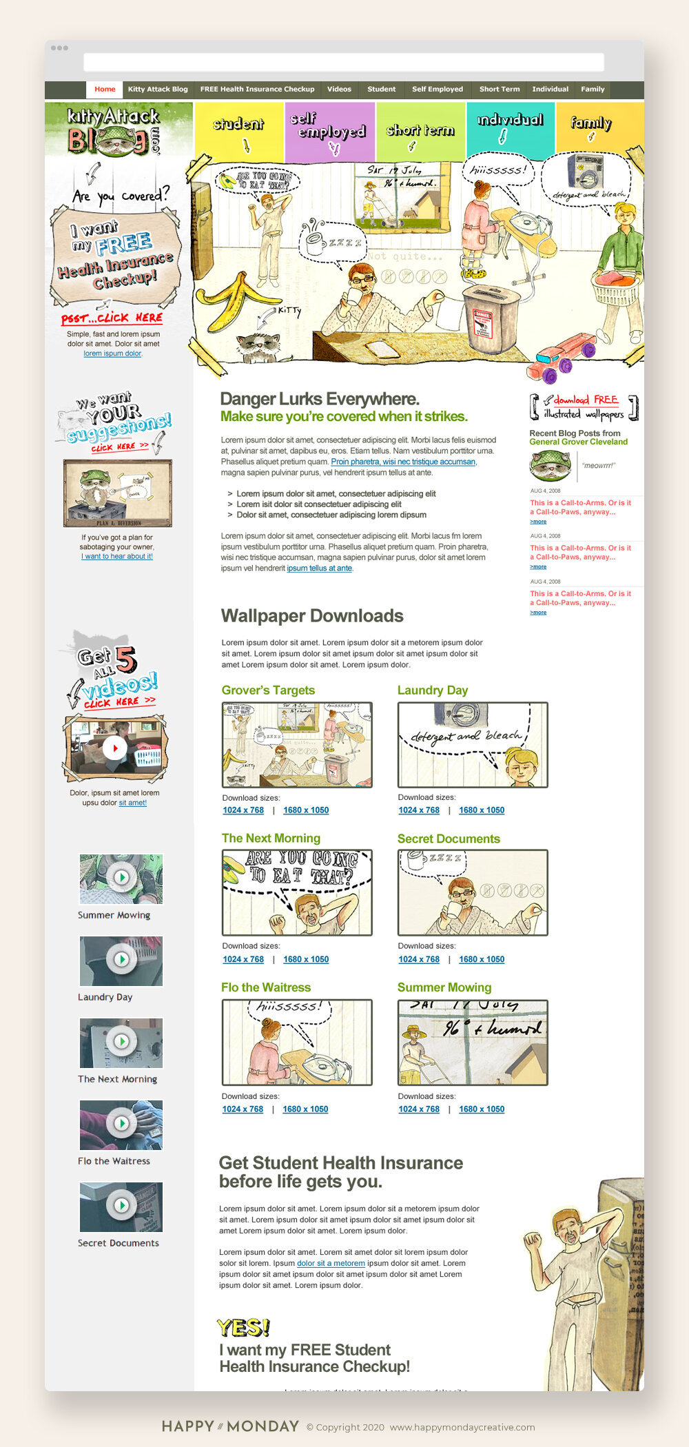
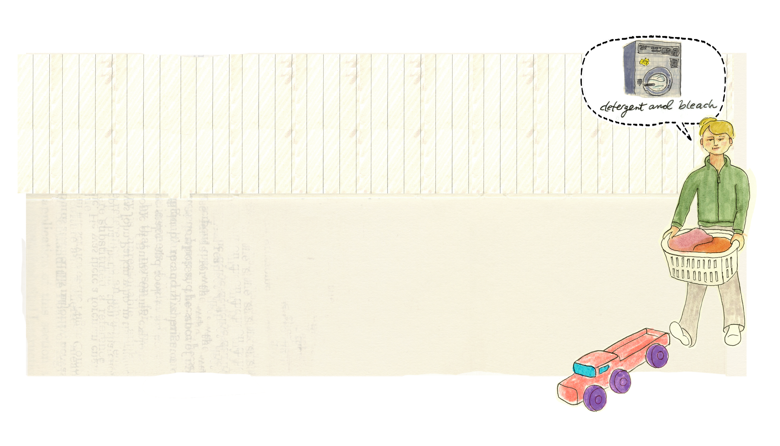
The illustration system is where the real work lives. Every scenario on the site — Grover's targets, laundry day sabotage, the next morning standoff, secret documents — was fully illustrated in a loose, hand-drawn style that balanced humor with genuine storytelling. The illustrations doubled as downloadable desktop wallpapers, giving visitors a reason to engage beyond just reading the blog. Videos added another layer of content that kept people coming back.
The navigation architecture organized serious insurance content — student, self-employed, short-term, individual, family — into a site experience so entertaining that users forgot they were being educated about health coverage. That's not easy to pull off.
The Result
A campaign weird enough to be memorable, smart enough to actually convert, and illustrated entirely by hand. General Grover would never admit it worked. But it did.
Danger lurks everywhere. Make sure you're covered when it strikes.