Maximus the Westie — Personal Brand Identity & Character Illustration
Logo Design · Brand Identity · Character Illustration · Brand Board
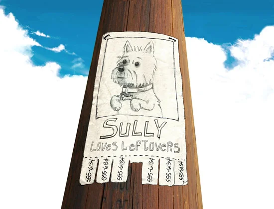
Every good character starts somewhere. For Maximus the Westie, it started as Sully — a scruffy, irresistible West Highland Terrier on a missing poster stapled to a telephone pole, with tear-off tabs at the bottom and one very important detail: Sully Loves Leftovers.
That illustration was the seed of a book. The brand came later.
By the time the character evolved into Maximus, the concept had grown beyond a single story into something that needed a full visual identity — a mark that could travel, merchandise, and build an audience. The missing poster became the brand's origin story, and the Westie at the center of it became the face of everything that followed.
The Westie Universe — A Character Evolution
Maximus didn't arrive fully formed. He evolved.
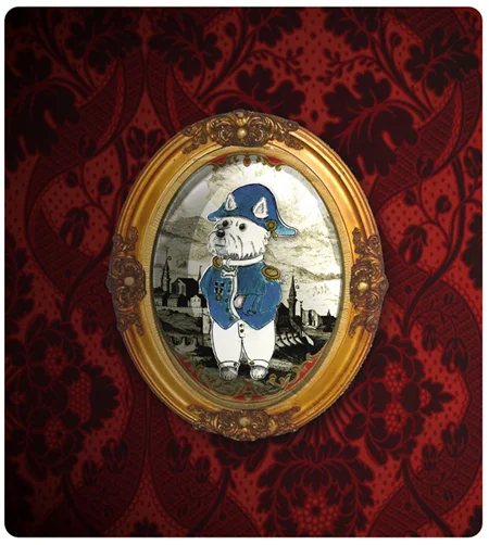
It started with Sully. Then came General Bonesaparte — the same irresistible Westie reimagined as a Napoleonic military commander, rendered in antique-portrait style, framed in gilt and hung on damask wallpaper like a dignitary who absolutely deserved it.
The portrait draws from a real moment in history: in 1798, Napoleon Bonaparte set sail for Egypt on an expedition that included artists, scientists, and archaeologists — and ultimately led to the discovery of the Rosetta Stone. General Bonesaparte captures that same sense of grand ambition and self-importance, filtered through the lens of a very small dog in a very large hat.
From Sully to Bonesaparte to Maximus — the character kept evolving, each version revealing something new about who he was and what he was capable of. That's how the best characters work.
The Work
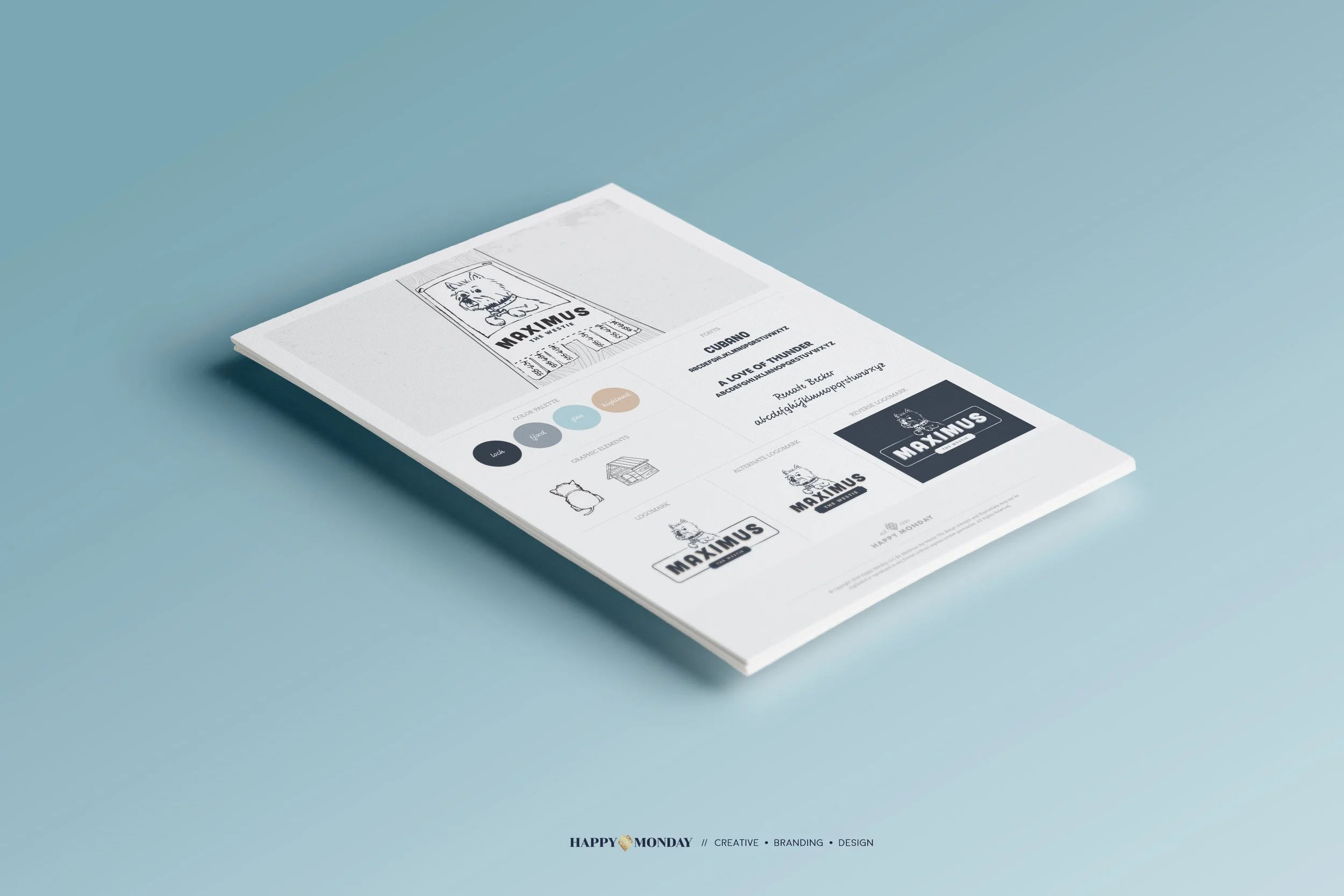
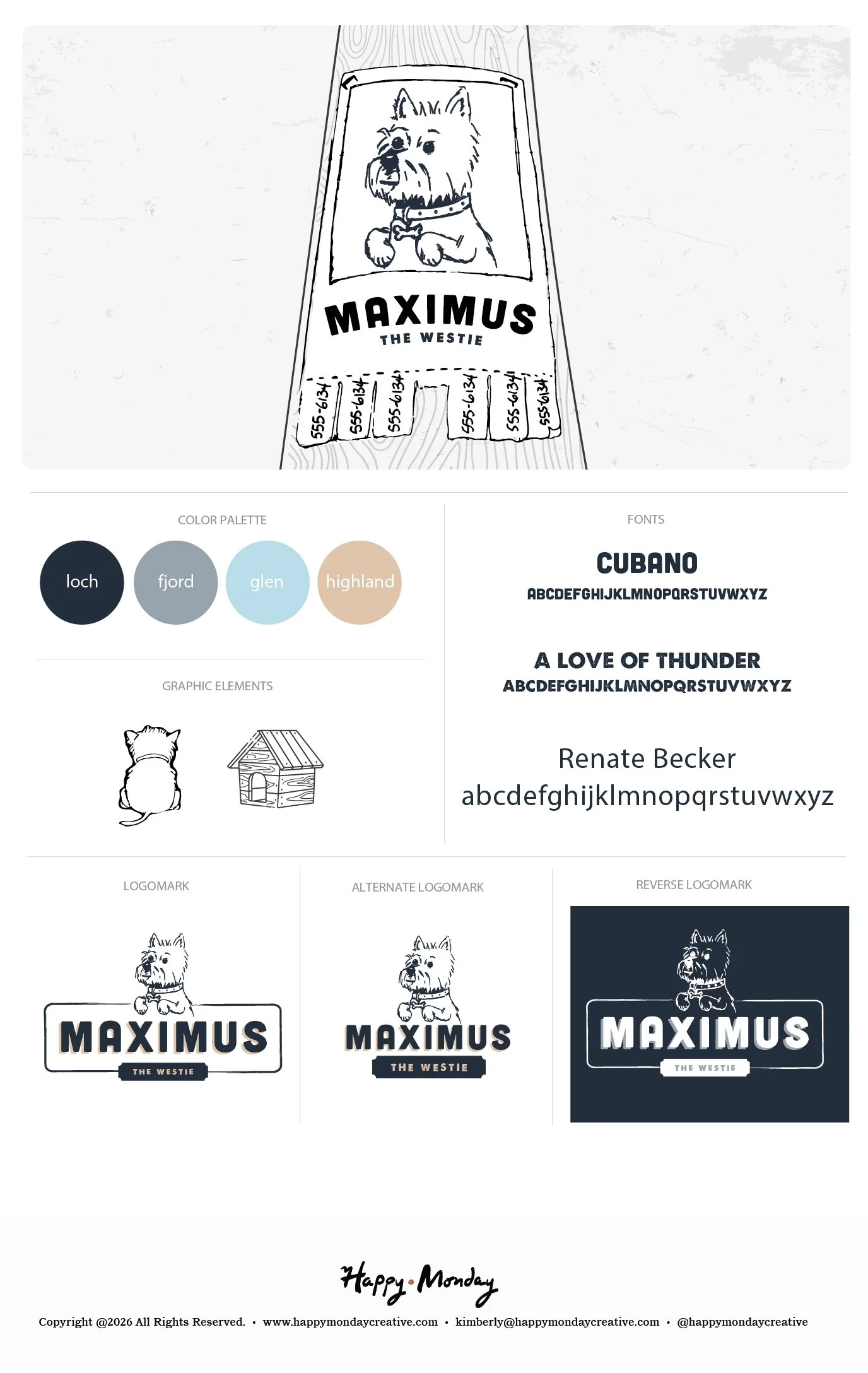
The brand board builds a complete identity system around Maximus — a hand-illustrated Westie character rendered with enough personality to anchor a children's book series, a social media presence, or a product line. The primary logomark pairs the illustrated character with a bold plate-style wordmark, giving the brand the kind of retro charm that feels timeless rather than trendy. Three logo lockups — primary, alternate, and reverse — give the mark flexibility across light and dark backgrounds and every application in between.
The color palette is named for the Scottish Highlands the breed calls home: Loch, Fjord, Glen, and Highland — deep navy, slate blue, soft powder, and warm sand. A palette that works as hard as the dog it's named after.
The graphic element library rounds out the system: a back-view Westie illustration and a hand-drawn doghouse, both rendered in the same loose, confident line work as the main character. The kind of details that make a brand feel like a world, not just a logo.
The Result
A personal brand with an origin story, a character with a name, and a visual system ready for whatever comes next — book, merch, or both.
Loves leftovers. Very good boy.
Interested in building a brand with this kind of depth?
If you're building something that needs a mythology behind it — not just a logo — this is the kind of work I love most.